Good morning. Claude's Fable 5 is back. The US government yanked it for two and a half weeks over cybersecurity fears. It's live again, now with a filter that punts anything sketchy to a weaker model.
Read on for today's top stories, plus Pilothouse's full-funnel critique of DTC's hottest funnel, belonging to Grüns.
🤖 Google's AI is writing what shows up under your Search ad
Google is now generating AI summaries that appear directly under some Search ads. The feature was spotted by Darcy Burk on X and reported by Search Engine Land.
The summaries include a disclaimer that the AI can make mistakes. Google has not indicated whether advertisers will have any control over the content, and the selection logic is undisclosed.
The practical exposure: a summary Google generates sits between the searcher and the advertiser's own message, surfacing information Google's model considers relevant to the query. Watch click-through rate on branded and high-intent terms if this rolls out wider.
🧂 McCormick got $28M back on tariffs the Supreme Court invalidated
McCormick, the spice and ingredient maker, received $28M in Q2 tariff refunds on country-specific duties the Supreme Court nullified this year, with another $3M coming in H2.
The company is using the returned funds to offset war-related cost inflation, currently tracking at 6% for the fiscal year on energy and logistics disruption through the Strait of Hormuz.
The Section 122 10% global tariff, the one expiring July 24, is still on the books.
🌆 The Empire State Building flag moment is turning into a brand pile-on
@mkobach shared this screenshot of dozens of brands dropping AI-generated versions of the viral flag image with their own messaging overlaid. @theisaacmed flagged the consumer response: brands inserting themselves into the moment are being read as hijacking it.
Aves Valerio, Sr. Creative Strategist at Pilothouse, put the paid performance frame on it in this LinkedIn post. Her take is that generating your way into a moment that already has cultural weight reads as opportunistic to the people scrolling through it.
Be intentional about the trends you choose to jump on and focus on how you can co-operate rather than co-opt.
📈 One creative reframe that lifted conversion 12.6%
@natelagos tested reframing negation-based ad openers as questions. "Don't let this pain point happen" becomes "Why would you let this pain point happen?" His reported lift from the switch: 12.6% conversion rate increase.
@SarahLevinger extended the pattern with four variations worth testing against each other:
"Are you ok with letting [pain point] continue?"
"Is there a reason you're letting [pain point] continue?"
"How long will you let [pain point] continue?"
"Everyone can see you're letting [pain point] continue?"
The fourth adds social observation as pressure. The third reframes the pain point as something ongoing in time. Test which angle matches the emotional register of your category before scaling.
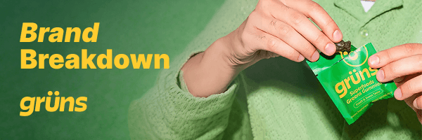
Grüns sold to Unilever this April for a reported $1.2 billion, built on roughly $50 million in funding after reaching a $500 million valuation and $300 million in annual recurring revenue last year.
Pilothouse's CRO team told me they reviewed the site and found a brand with real advantages already in place: a clinical study, more than 98,000 reviews at a 4.77 star average, and over a million customers.
Here are a few specific spots where more of that traffic could convert.
The homepage headline could work harder to sell the product
The current headline reads "Daily Nutrition Never Tasted So Good." A first-time visitor deciding whether to spend $40 a month is looking for proof the product works. Taste is a secondary consideration at that stage.
Pilothouse suggested testing: "Fill the Nutrition Gaps 90% of People Have, in One Gummy Pack a Day." This leads with outcome and credibility.
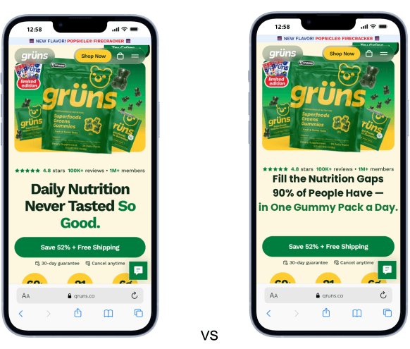
Pilothouse also flagged that the million-member count and press mentions sit low on the page, past the point most visitors scroll.
Discount messaging conflicts across the site and paid ads
Pilothouse found this confusing. The site advertises up to 61% off in one spot and 52% off in the footer, with both numbers also showing up in the Meta ads.
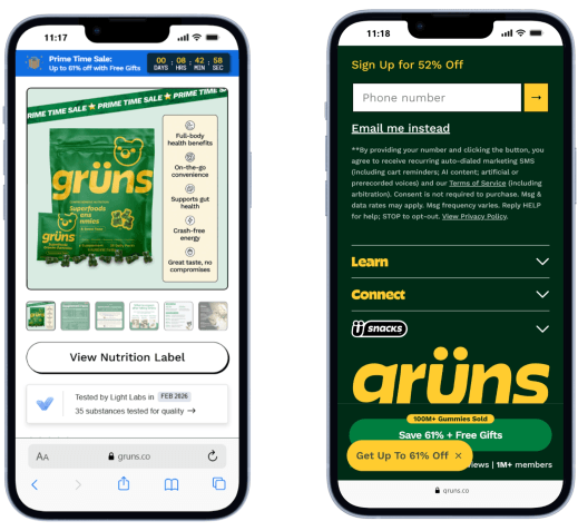
A visitor who sees 61% first has less reason to act on a 52% offer later in the funnel.
Pilothouse recommends picking one number and checking it across every page and every ad each time the discount changes.
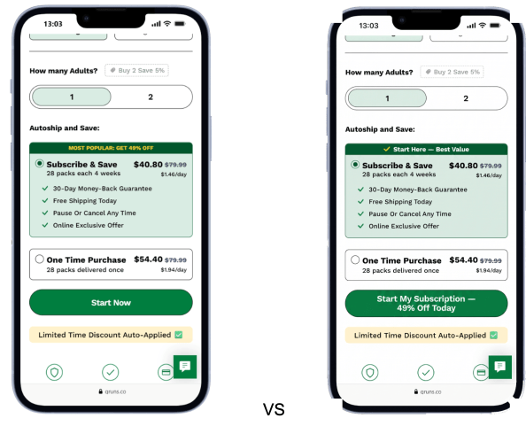
The subscribe button could name the action more clearly
The CTA reads "Start Now" on a page where a visitor is choosing between subscribing and a one-time purchase.
Pilothouse's suggestion: name the action directly, something like "Start My Subscription, 49% Off Today," and add a line under the button such as "30-day money-back guarantee, no questions asked." They'd also reword "No Free Shipping" on the one-time option to "Free Shipping over $60," communicating the same condition with clearer framing.
The product page has room to load faster
Pilothouse ran a product page through PageSpeed Insights and got a score of 24.
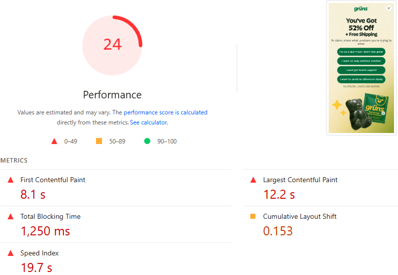
First Contentful Paint came in at 8.1 seconds, Largest Contentful Paint at 12.2 seconds. The page fires 32 external scripts, tools like Intelligems, Northbeam, Heatmap, and Gladly among them, and 65 to 75% of Grüns traffic hits this page on mobile.
Google's own research puts the cost at roughly 1% of conversion per 100ms of load time.
Audit which scripts need to fire on load, defer the rest, and measure the conversion change over two weeks.
The Science page could convert more of the traffic it already earns
Pilothouse called this Science page one of the strongest pages on the site: a double-blind, placebo-controlled study, presented through the Dr. Barry the Bear mascot in a way that stays approachable.
The first CTA sits at the bottom of the page, after trust is already built. The "Clinically tested" badge on product pages has no link to the study.
The team recommends adding a CTA after the core study summary, and linking the "Clinically tested" badge on product pages directly to the Science page.
The Popsicle Firecracker page has a few quick wins available
The Firecracker page is priced well at $1.41 a day on the 12-week option. Pilothouse found the reviews anchor link broken, with no review content above the fold. Both matter on a limited-flavor page, where shoppers decide fast whether the variant is for them.
The simple solution is moving reviews up, adding the flavor description higher, and moving the video off the third-party app that's slowing the page down.
Grüns has an opening to strengthen its presence with AI engines
AI assistants answering questions like "which green supplement has the best absorption" pull from whatever structured data the site provides. A well-structured llms.txt file gives AI assistants the data needed to classify the product correctly.
The Pilothouse recommendation: a standard file with an H1 naming the brand, a blockquote defining it as a whole-food supplement, and H2 sections linking to the pages that answer the most common questions.
Conclusion
The fixes above target specific friction points between existing traffic and the site's highest-value actions: headline, discount consistency, CTA clarity, load speed, page conversion, and llms.txt structure.
Did you find this valuable? Support us by checking out our businesses:
Please note that items in this newsletter marked with * contain sponsored content.
.svg)


.svg)


.svg)


.svg)
.svg)
.svg)