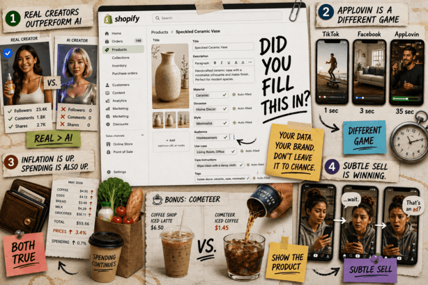
Good morning. It's the first Friday of summer and H2 is almost here. In today's brand breakdown, we analyzed five of Cometeer's Meta ads to uncover one habit worth breaking: when you're in a class by yourself, don’t lean on competitor comparisons. But first…

🛍️ Shopify is filling in your product data whether you like it or not
When an AI agent queries your Shopify store, it doesn't just get your title, price, and photos. Yiqi Wu (@yiqiw_) said it gets an automatically generated block of structured attributes, style, material, and occasion that Shopify infers from whatever data you've already filled in.
If you haven't filled in your metafields, Shopify is guessing. And whatever it guesses is what AI agents see when they're deciding whether to recommend your product and what to highlight.
If you haven’t already, go fill in your own metafields so your data takes priority over Shopify's inference. We said yesterday that feed quality is now a revenue problem. This is exactly what we meant.
🏆 Creator partnerships the key to Meta success in 2026
@herrmanndigital is watching something interesting in the accounts actually growing right now. The ones with 20-30% of total spend going to creator partnerships and whitelisted pages are seeing revenue up and CPAs slightly down year over year. In this market that's a big win.
His theory on why: real creators bring their social graph with them. The algorithm uses that network to unlock fresh audiences your existing creative can't reach. AI creators don't have that. They have a face and a voice and nothing behind it. Turns out that matters.
His closing line says it all: "Long real creators." Get a few on retainer, refresh them often.
One footnote if you're in New York or targeting New York customers: there's already a law requiring disclosure on synthetic AI ads, $1,000 per violation, $5,000 for repeat offenders. Not the reason to use real creators, but a useful footnote.
📱 AppLovin is not just cheaper Meta inventory
Earlier this week, I told you that AppLovin opened self-serve to everyone. The early read from operators who've been on it longer: don't just dump your existing Meta creatives in and hope.
The biggest reason is watch time. AppLovin averages 35 seconds. Facebook is 3 seconds. TikTok is 1. The format that's actually converting is 30 to 60 second videos, a real person talking to the camera with B-roll and big captions. Your six-second scroll-stopper was built for a completely different environment.
The other gate is audience fit. AXON runs on mobile gaming player data, so you're essentially betting that the person playing Words with Friends at midnight also buys what you sell. That's not a given. Worth being honest with yourself about category fit before you spend to find out.
💸 Inflation is up. Spending is also up. Figure that one out.
It was announced yesterday that the Fed's preferred inflation gauge hit 3.4% in May, the highest since October 2023, and consumer spending jumped 0.7% the same month, stronger than anyone expected. Both things are true at the same time, which is either encouraging or confusing depending on how your week is going.
We saw the same thing in Prime Day baskets the other day. Smaller orders, more of them. Shoppers aren't stopping, they're just getting deliberate about where the money goes.
The demand is still there. The margin pressure is also still there. Welcome to the rest of 2026 - it’s time to get crafty.
🎯 Selling subtly with native social ads
She downloaded the app before she even realized it was an ad.
The video was organic-looking content with a subtle sell dropped in the middle, not at the end. Sarah calls out, “Future of ads = the subtle sell?”
The fact that it worked on someone who studies this stuff for a living says something. Worth watching the example she posted.
The subtle sell is a continuation of the trend towards “native social” ads (that don’t look like ads) that Salt and Stone’s Ari Murray spoke to me about in a soon to be released DTC Podcast episode.
Are you noticing a trend to more subtle native social ads? Reply back and tell me.
Cometeer is a Massachusetts-based coffee brand founded in 2019 by Matt Roberts, built around reinventing premium coffee through flash-frozen capsules sourced from top specialty roasters.
Rather than traditional pods, Cometeer brews high-quality coffee, flash freezes it to preserve flavor, and ships recyclable aluminum capsules directly to consumers, allowing customers to make hot or iced coffee in seconds.
By combining convenience with specialty-quality coffee, Cometeer has positioned itself as a modern disruptor in the premium coffee space.
The Pilothouse Meta team took a look at their current Meta Library to spot what’s working and where the biggest opportunities lie.
Ad 1: National Cold Brew Day
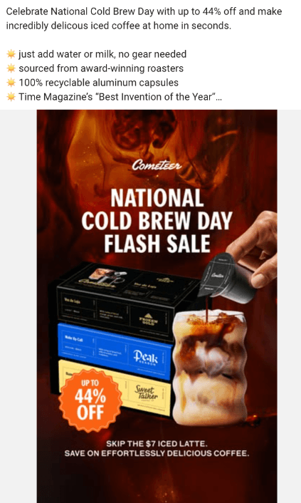
This National Cold Brew Day creative is well-structured.
A prominent orange badge leads with a meaningful discount, and tying the offer to a micro-holiday gives it a timely hook. For a brand in the premium coffee space, leaning into culturally relevant moments like this is smart.
There are also a few opportunities to make the creative even more effective.
The subheadline “Skip the $7 iced latte. Save on effortless delicious coffee” communicates a real cost-savings benefit, but the font size makes it easy to overlook, particularly on mobile, where most impressions are likely to happen.
One area with room for improvement is the product presentation. The packaging shown may resemble standard coffee pod boxes at first glance, particularly for people unfamiliar with the brand.
Because Cometeer's product is different from traditional coffee formats, making that distinction instantly clear could strengthen first impressions.
A cleaner shot of the product being poured into a glass could communicate the product experience more clearly while making the creative feel even more appetizing.
💡 Pilothouse Tips:
✅ Capitalize on micro-holidays. The Cold Brew Day hook is a strong one. If this creative is performing well, there’s no reason to pull it when the day ends. Most consumers don’t track when micro-holidays start or stop. Keep it running as long as the numbers hold.
✅ Lead with the product experience, not the packaging. A visual of the capsule being poured into a glass (showing the actual coffee) is cleaner, more appetizing, and makes the product easier to understand at a glance.
✅ Increase the subheadline font size. The cost-savings message is one of Cometeer’s strongest hooks. It needs to be readable on a phone screen.
Ad 2: Daylight Savings
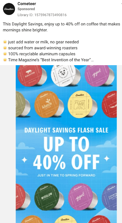
The Daylight Savings creative is visually strong. The mix of colors and the bright blue background give it real stopping power in a feed.
Tying the creative to a moment when people are genuinely tired and reaching for coffee shows strategic thinking. The insight is sound even if the holiday isn’t coffee-specific.
Adding a little more product context could make this creative even stronger for people discovering the brand for the first time. Explaining what Cometeer is earlier in the ad would make the value proposition easier to understand.
💡 Pilothouse Tips:
✅ Add product-forward copy. A line that orients cold traffic like “SAVE BIG ON THE COFFEE CONCENTRATE THAT’S CHANGING THE GAME” gives unfamiliar viewers a foothold before they scroll away.
✅ Position Cometeer as a category disruptor. The product is genuinely new. The copy should reflect that ambition and set expectations accordingly.
Ad 3: Comparison Ad
This creative takes on a comparison format, positioning Cometeer against coffee shop prices.
The strategic angle is strong. Cost savings relative to a $7 latte is a compelling message. There are a few opportunities to make the execution even stronger.
The text feels fairly small for a mobile-first platform, making the key message easy to miss. On a desktop it's already difficult to read, and on mobile the message becomes even easier to miss.
The coffee cup visuals communicate the category, though some of that space could also be used to reinforce what makes Cometeer unique.
💡 Pilothouse Tips:
✅ Design for mobile first. If an ad is hard to read on a desktop screen, it won’t work on a phone. Increase font sizes significantly, simplify the layout, and swap the generic visuals for single-color backgrounds that let the copy breathe.
✅ Make the generic visuals work harder. Smaller coffee cup graphics, larger text, and a cleaner layout would increase legibility without requiring a full rebuild.
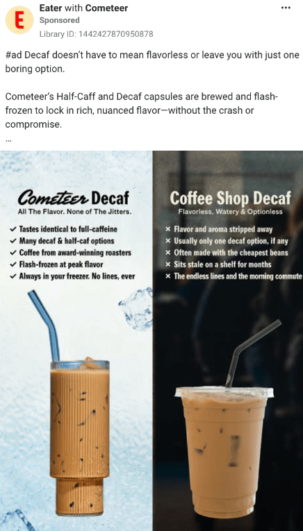
Ad 4: Anti-Nespresso Positioning
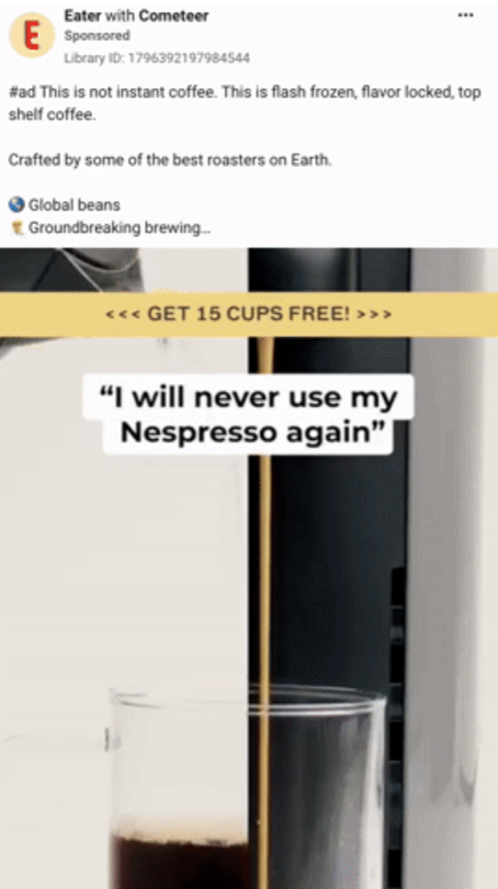
This video takes a bold comparative approach by calling out a competitor directly. Today, audiences often respond best when comparison ads are paired with a clear product story.
This one calls out Nespresso directly. And while comparative advertising can work when it’s grounded in a specific, credible claim, the strongest comparison ads usually pair the comparison with a memorable point of differentiation.
Adding a more explicit product benefit alongside the comparison could make the message more persuasive. Viewers who are happy with their current routine may need a stronger reason to consider switching.
There’s also a practical risk: ads that lean heavily on a competitor’s name often generate comments defending that competitor. In some cases, heavy competitor references can shift attention toward the competitor rather than reinforcing the advertiser's own brand.
💡 Pilothouse Tips:
✅ Broaden the competitive framing. Positioning against a single competitor can narrow the audience.
A line like “Better than instant, pods, or the corner coffee shop” speaks to a wider set of buyers without relying on Nespresso’s brand recognition to do the work.
✅ Build persona-based creative. If direct comparison is part of the strategy, the most effective approach is to understand why people use Nespresso specifically (convenience, cost, familiarity) and address each of those motivations directly. That way, the creative speaks to a real need rather than just positioning against a brand name.
Ad 5: Nespresso Heavy Ad
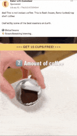
This video ad continues the Nespresso-focused approach.
One interesting creative choice is the amount of screen time dedicated to Nespresso imagery relative to Cometeer's own product.
Cometeer is featured throughout, though increasing the time spent showcasing its own product could further strengthen brand recall.
Cometeer’s product has a genuinely compelling visual story: the flash-freezing process, the capsule, the pour. Those are the kinds of visuals that build distinctive brand memory. Showing more of them would reinforce what makes Cometeer unique.
💡 Pilothouse Tips:
✅ Lead with Cometeer’s own process. Flash-freezing coffee is a distinctive, visual story. Show it. The pour from capsule to glass, the iced coffee build, the texture and color… these are the proof points that build preference over time. Edit this creative with more Cometeer-focused visuals and B-roll.
✅ Reduce reliance on competitor footage. Competitor references can be an effective hook, though increasing the amount of Cometeer-focused storytelling would help build stronger brand equity over time.
Conclusion
Across the creative library, Cometeer frequently uses familiar reference points like competitors, coffee shops, and timely moments to quickly establish context.
That approach can be effective, particularly for acquisition. At the same time, there is an opportunity to spend more of the creative reinforcing what makes Cometeer itself memorable.
The product itself is already a compelling story. Flash-frozen specialty coffee from world-class roasters, ready in seconds, without a machine, is a differentiated value proposition. The current creative introduces those strengths, and there is room to make them even more central to the story.
One area worth exploring further is persona-specific creative. Cometeer's potential buyers don't all look the same. Nespresso users value convenience and consistency. Coffee shop regulars value quality and ritual. Busy parents value speed. Speaking directly to the motivations of each audience can help the creative feel more relevant while showcasing the aspects of the product that matter most to each group.
Did you find this valuable? Support us by checking out our businesses:
Please note that items in this newsletter marked with * contain sponsored content.
.svg)


.svg)


.svg)


.svg)
.svg)
.svg)