Good morning,
Here’s what you’ll find in today’s DTC:
1️⃣ Four easy-to-design ad formats that are built to convert
2️⃣ How Coyuchi approaches growth, attribution, and retention in a high AOV category
You’re reading this newsletter along with new subscribers from: Solmates, Moolah Kicks, and Friendly Shoes. 👋

🎨 Four Proven Static Styles You Can Make Today
These static formats are proven performers, each one quick to assemble and simple to iterate.
Whether you're building your first test or scaling what's working, here's how to use each one effectively.
1️⃣ Product-focused grid

Here’s a photo collage that lets your product do the talking.
This works especially well in lifestyle-driven categories like jewelry, beauty, and home decor where the product speaks for itself.
How to make it work:
✅ Mix your shot types. Pair close-up detail shots (texture, material, craftsmanship) with wider lifestyle images in the same grid. The contrast makes it visually dynamic and stops the scroll.
✅ Reserve one panel for copy. Swap one photo cell for a clean text panel with a short hook, brand name, or product claim. This is especially important for top-of-funnel placements where cold audiences need a reason to click.
✅ Build a reusable promo version. Once you find a grid that performs, create a "generic sale" variant with broad promo copy (e.g. "Sale ends Sunday" or "20% off").
Keep it vague enough to reactivate for any promotion. This protects social proof on the ad unit and helps algorithm delivery when you switch it back on.
✅ Use it for bundles. Feature different SKUs in each panel to communicate a product range, or pair a hero product with complementary items that are frequently bought together.
2️⃣ Product with repetition text

This repeated text pattern is simple to produce and visually punchy.
Use a short and catchy phrase in bold font to make a splash.
How to make it work:
✅ Keep the copy short. Use two to five words max. This format lives or dies by the copy. Something like "Focus & Chilled" works because it's memorable, and doesn't try to explain the product.
✅ Pull your color from the product. Match the text color to your packaging or brand palette for a monochromatic effect. This makes the visual feel intentional.
✅ Use it to amplify your winning angle. If you already know a specific message converts (from email, landing page tests, or previous ads), this format is ideal for giving it a new visual treatment without changing the underlying idea.
✅ Default to sale copy when stuck. If your product is complex and limited copy feels impossible, lean on promo moments (e.g. Black Friday).
Last chance or Final sale messaging are also proven performers, because they're familiar and create urgency without explanation.
3️⃣ 2 Panel Grid
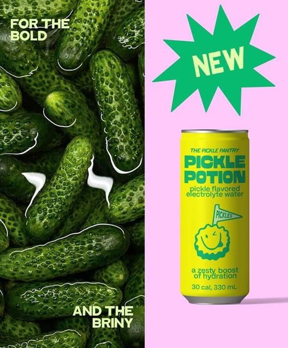
A clean split-screen: your product on one side, a contextual supporting image on the other.
The format does dual work: it shows the product and signals the category, benefit, or USP simultaneously.
Pilothouse shares this is one of the most efficient formats for communicating what makes you different.
How to make it work:
✅ Be deliberate with your supporting panel. The second panel should do real work. If you sell pickle-flavored drinks, show actual pickles!
You're pre-qualifying your audience and triggering an immediate reaction.
✅ Use it to highlight a technical feature. If your product has a design detail that competitors lack (e.g. a special lid, or a unique material) pair that close up in one panel with a full product shot in the other.
✅ Layer in copy strategically. A short text overlay on one panel can add context without cluttering.
✅ Test different right-hand panels against the same product shot. Keep the product panel static and A/B test different supporting images that relate to a different benefit angle. It’s fast and easy to iterate.
4️⃣ Monochromatic product focused
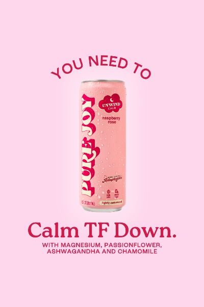
Product shot centered on a solid background that matches or complements the product's color palette. Headline above, subheading below.
It’s clean, fast, and endlessly riffable.
This is great for testing messaging angles against specific audiences.
How to make it work:
✅ Use the headline/subheading as a pair. Your headline should hook with a big claim or intriguing angle. Your subheadline delivers the proof or detail that makes the headline credible.
Think of it as a one-two punch. E.g. "Calm TF Down." followed by "With magnesium, passionflower, ashwagandha and chamomile."
✅ Write for 30,000 ft. Cold traffic has no context for your brand. Use plain, direct language instead of jargon. If someone who'd never heard of you can't instantly understand the appeal, simplify it.
✅ Run angle tests by persona. This format is ideal for structured creative testing.
Keep the product image identical, swap only the headline and subheadline copy, and target each variant to a different audience segment.
The data tells you which angle resonates with which person. An invaluable signal for scaling.
✅ Resist adding more. The biggest mistake is cluttering this format with bullet points, badges, or extra copy.
Keeping it succinct is what makes it feel premium.

How Coyuchi Tested True Meta Incrementality (6 Week Blackout Results)
Vicky Grahan, Brand President of Coyuchi, explains how the premium bedding brand shifted from a wholesale business to DTC and how to scale a brand with a long purchase cycle and high AOV.
She explains how they tested Meta’s impact by turning it off, how they think about LTV in a low-frequency category, and why product selection inside ads matters as much as creative.
We cover:
Manus acquisition blocked. China’s National Development and Reform Commission blocks Meta’s $2B takeover of AI startup Manus. Read more →
OpenAI misses revenue targets. The company missed its projections for user growth and revenue, sparking concerns. Read more →
Devil Wears Prada collabs. Big brands like Smartwater, L'Oréal, and Diet Coke are celebrating the iconic film’s sequel with creative campaigns. Read more →
📥 Got a B2B Biz?
Join dozens of B2B companies finding demand-gen success through our niche community of 150k brand leaders and founders this year. Talk to our team to learn more.
Don’t forget to rate the DTC Podcast on Apple (⭐️⭐️⭐️⭐️⭐️)
DTC Newsletter is written by Rebecca Knight and Frances Du. Edited by Eric Dyck.
Please note that items in this newsletter marked with * contain sponsored content.
.svg)


.svg)


.svg)


.svg)
.svg)
.svg)