Good morning,
Here’s what you’ll find in today’s DTC:
1️⃣ We analyze conversion blockers that impact Every Man Jack’s site experience.

👀 Looking For The Next Ecommerce Strategist
Enjoy our Brand Breakdowns? The strategic thinking behind them comes from the team at our sister company, Pilothouse.
Pilothouse is looking for an Ecommerce Strategist to help lead growth strategy for a portfolio of ambitious DTC brands.
You'll work directly with founders, own the strategic direction of accounts, and coordinate specialists across Meta, Google, TikTok, Email, CRO, Creative, Analytics, and Amazon.
If you can spot the biggest constraint to growth, build a plan, and rally a team around execution, this role is for you.
🧔 What’s Stunting Growth On This Grooming Site
Every Man Jack was founded in 2006 and started off with just a dozen men’s grooming products before expanding into haircare, skincare, and beard products.
Today, the California-based brand is sold in major retailers including Target, Walmart, and Whole Foods, with annual revenue reportedly surpassing $100 million.
This year’s rebrand marks a clear shift as the company moves from an outdoor aesthetic to celebrating the resilience of men with the tagline “For Men Who Put In The Work.”
One opportunity may be shifting more of the site experience from individual product discovery toward building complete grooming routines.
Conversion blockers summary
Three friction points stand out before a visitor ever reaches checkout:
1️⃣ Scent Discovery Friction. With 10+ scents per collection and no quick way to understand the vibe of each, visitors are left clicking through PDPs one by one.
2️⃣ Bundle Friction. The “Build Your Own Bundle” feature is buried far below the fold. Many shoppers may prefer purchasing a complete routine rather than assembling one product by product.
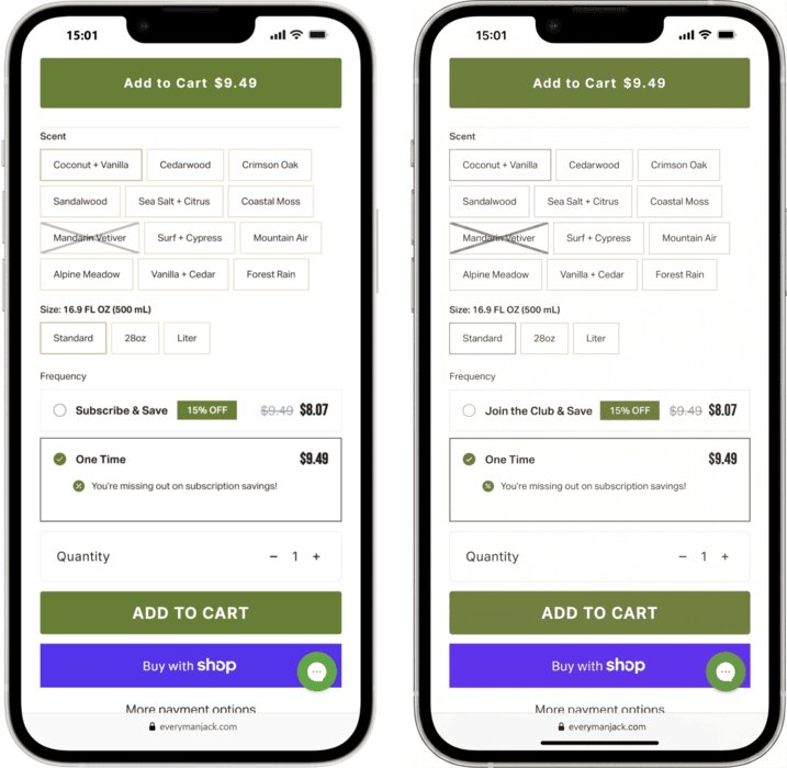
3️⃣ Underworked Subscribe & Save. The subscription offer leads with a 15% discount but never sells the convenience. There’s no “never run out” framing, no routine narrative. The subscription experience appears heavily focused on savings, leaving room to reinforce convenience and replenishment benefits.
1. Brand clarity on homepage
The hero section currently leads with “New Arrivals” and collection tiles. For returning customers already familiar with the brand, this may be sufficient.
For a new visitor, it leaves the most important question unanswered: why Every Man Jack?
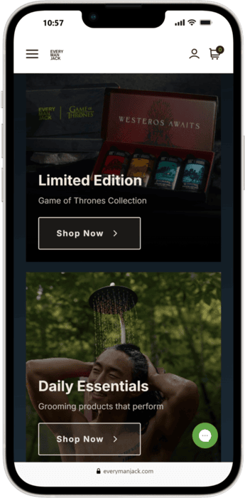
First-time visitors may understand the category immediately, but have less clarity on what differentiates Every Man Jack from other men's grooming brands.
The functional benefit of the product line doesn’t get communicated above the fold. That’s a missed conversion.
Pilothouse Tips:
✅ Add a "Grooming for Your Goal" section below the collection tiles. Use direct out-come focused copy like "Tame the Beard," "Hydrate Dry Skin," "All-Day Freshness." This gives visitors a clear next step based on what they actually need.
✅ A/B test the hero CTA. "Shop All" vs. "Find Your Scent." The second framing signals that the site will help visitors choose, which reduces the scent paralysis problem at the earliest touchpoint.
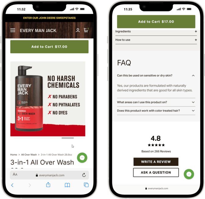
2. PDPs findings
The PDP pages contain a ton of quality product images and strong social proof above the fold, but they could be doing more to optimize.
There are 3 main issues here.
1️⃣ Scent descriptions lean heavily toward fragrance terminology. Top notes and base notes work in the cologne aisle.
Many shoppers may care more about how a scent feels in everyday use than traditional fragrance-note descriptions. The current copy reads more like a fragrance spec sheet than a product that fits into someone’s morning routine.
2️⃣ Lack of "action" shots. The bottle images are clean and the text overlays are informative. Texture imagery exists, but could play a more prominent role in the image sequence. A shot of the soap lathering, the beard oil on fingers, the thickness of a moisturizer. These visuals communicate product quality faster than any copy block.
3️⃣ No narrative structure. The copy mentions useful details (“good for dry or sensitive skin”), but it doesn’t follow any structured logic.
The content could follow a more deliberate problem-to-outcome structure to help the visitor understand why this product is the right choice for them.
Pilothouse Tips:
✅ Add scent "vibe" tags. Help customers find their desired scent quickly by using tags like "The Fan Favorite," "Deep & Rich," or "Crisp & Clean."
✅ Include texture close-ups. Move the lather image out of the gallery and into the main image stack. Don’t make customers scroll to find the most persuasive visual.
✅ Turn each PDP into a structured story. problem → promise → proof → how to use → why EMJ vs others → guarantee.
This doesn’t require a full redesign, just a deliberate reordering of content that’s already there.
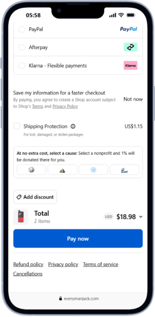
3. Checkout
The checkout is built on a standard high-converting Shopify layout, and that’s a genuine strength.
What’s missing is the brand layer, specifically the signals that address a hesitant first-time buyer’s real concern: “What if I order this and don’t like the scent?”
The page confirms that transactions are secure and encrypted. That handles the technical trust question. It leaves additional room to address the brand trust question.
There’s also a framing issue with the Shipping Protection add-on at $1.15.
The feature is a useful revenue line, but the copy presents it as an optional fee rather than a benefit.
Pilothouse Tips:
✅ Add strategic "Risk Reversal" badges. Add 3 small icons directly below the "Pay now" button that say Cruelty Free, Easy Returns, and a 60-Day “Smell Great” Guarantee. These address the “what if I don’t like it” hesitation at the right moment.
✅ Reframe the "Shipping Protection" copy. Try: “Carbon-Neutral Shipping Protection. Guard against loss, theft, or damage.”
The environmental angle adds an emotional benefit to opt in, while protecting against damage offers a clear functional benefit and justifies the $1.15.
4. Site Speed
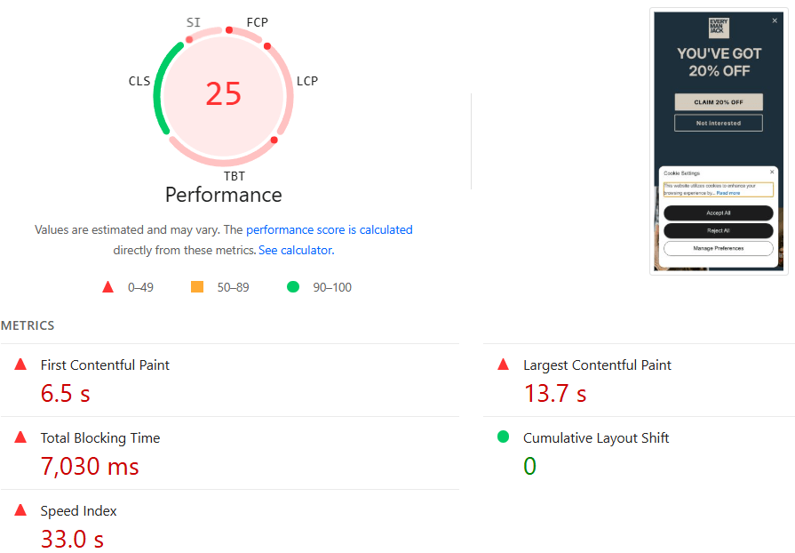
A mobile performance score of 25, a Total Blocking Time of 7.030ms, and a Largest Contentful Paint of 13.7 seconds are the most urgent technical problems in this audit.
For seven full seconds, a mobile user’s phone is frozen before they can interact with the page. Mobile performance issues are often associated with lower conversion rates, making this one of the highest-impact opportunities identified in the audit.
The root cause is JavaScript bloat from third-party apps loading simultaneously: tracking pixels, heatmaps, rewards programs.
Also, the browser is competing with itself to render two overlays while also loading the actual store.
The screenshot below shows a 20% OFF popup and a Cookie Settings banner firing simultaneously. This creates "main thread" contention—the browser is struggling to render two complex overlays while trying to load the actual shop.
Pilothouse Tips:
✅ Audit and prune Shopify apps. Go into your Shopify admin and identify every app you aren't actively using. Deleting an app's dashboard isn't enough. You must manually remove the leftover code from theme.liquid.
✅ Delay the "20% OFF" popup. Do not fire it until at least 10 seconds have passed or the user has scrolled 50% of the way down. This frees up the browser to handle the First Contentful Paint (FCP).
✅ Implement Cloudflare or Akamai Zaraz. Use a third-party manager to offload tracking pixels (Meta, Google, TikTok) to the "edge."
This prevents those scripts from running on the user's phone, which will instantly slash the Total Blocking Time.
5. A/B Tests to Run Now
Here are two high-priority tests that require minimal development time.
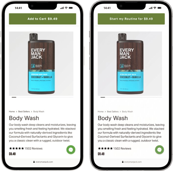
1️⃣ PDP CTA: “Add to Cart” vs. “Start my Routine”
Changing the primary CTA to “Start my Routine for $9.49” reframes a single-item purchase as the beginning of a system.
One hypothesis is that this language could increase multi-item order rates by priming the customer to think in terms of a full routine rather than a single product.
2️⃣ Subscription Label: “Subscribe & Save” vs. “Join the Club & Save”
The existing label is functional but generic. “Join the Club & Save” introduces a sense of belonging that aligns with the brand’s community-forward identity.
Test this against the subscription conversion rate and average order frequency.
Pilothouse Tips:
✅ Run both tests simultaneously. But on different PDPs to isolate results clearly.
✅ Track metrics. Look at subscription rate, AOV, and 90-day purchase rate to see if this moves the needle.
Conclusion
Every Man Jack has done the hard work: real products, real retail scale, and real brand equity with an audience that responds to the “For Men Who Put In The Work” positioning.
The opportunity lies in the digital experience. The site does a strong job merchandising individual products, while leaving room to make routines and systems more prominent throughout the buying journey.
🛒 Your customers are buying what AI is recommending. Peec AI asked 12 experts how AI picks the brands it recommends and how yours can be one of them. Get the free report. *
* sponsored
Did you find this valuable? Support us by checking out our businesses:
DTC Newsletter is written by Rebecca Knight and Frances Du. Edited by Eric Dyck.
Please note that items in this newsletter marked with * contain sponsored content.
.svg)


.svg)


.svg)


.svg)
.svg)
.svg)