Gooooooooooood morning. Happy Friday!
Quick one here from our sister company, Pilothouse, before we get into it. 👇
👋 Hey, Pilothouse here! One of our best and brightest is giving a webinar with Triple Whale next week on how to win the 2026 BFCM weekend.
He’s the real deal, he’s gonna be on the panel with some major players in the space. If you check out the DTC Podcast, you can see a ton of times he’s been on - they’re all gold.
If you want to see him live in action, you can sign up for this webinar that’s happening on August 25th at 1pm ET.
Grab a spot here if you want it.
Okay, let’s get into your pre-weekend read.
📧 @maxwellcopy found the highest-opened email you're probably wasting on "thanks for your order."
Don’t overlook order confirmation emails. They can pull some of the best open rates in your whole flow. @maxwellcopy highlights Dense’s stellar order confirmation creative. See the screenshot here.
It welcomes the customer, restates the benefits they’re about to get, and sets clear expectations when it comes to results.
The email closes with a real invite to reach out if something feels off. If your confirmation email is still just an order number and a shipping estimate, that's your highest open rate slot sitting empty.
🎯 Meta is taking away manual placements. You can bid them down and hope.
David Herrmann spotted a Meta notice saying advertisers will lose the ability to exclude placements, platforms, devices, and operating systems at the ad-set level. Meta points you toward placement value rules, creative customization, and account-level controls, but Herrmann says value rules only let you reduce a placement bid by 90%, so unwanted placements can still receive spend. Meta’s public documentation still describes manual placements and gives no rollout date, so this appears to be an unconfirmed account-level rollout for now.
🤖 AI shoppers convert 60% better than everyone else
That traffic source with weirdly good behavior and no keywords attached? That's AI.
Adobe shares referrals from AI are up 62% YoY and roughly 1,200% since October 2024, and those visitors convert 60% better, stick around 59% longer, and add to cart 28% more than everyone else.
Here's the catch. The average retail homepage is only 61% readable by shopping agents like ChatGPT and Gemini, down to 59% for grocery. If your product pages are Javascript-rendered spaghetti, you're invisible to the fastest growing, highest converting channel you've got.
🔍 Google's now suggesting your ad extensions too. Hope you're still reading them.
There’s a new prompt showing up in Google Ads: "I found some sitelinks for you."
Google crawls your landing page and hands you pre-built sitelinks to approve with one click, no more digging through your own site for extension ideas.
It's a small time save and probably a small CTR bump if you actually check what it picked. Just don't be the account manager approving links to a discontinued product page because the button was right there.
💡 Strong Product Story, With A Few Creative Opportunities
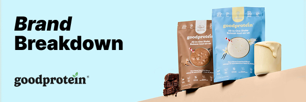
Good Protein has sold more than 75 million plant-based shakes to date. The nutrition brand’s catalog includes superfood blends and All-in-One Shakes with fun flavors like Piña Colada and S’mores.
The Pilothouse Meta team analyzed their ads and found a strong product story, along with a few opportunities to tighten copy consistency and refresh some of the creative.
1️⃣ Test beyond the sticky-note format
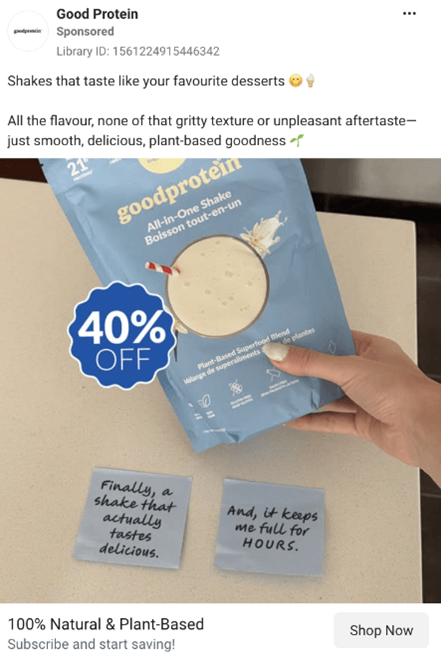
This creative keeps things simple, pairing a 40% off badge with a product shot. In place of standard text overlays, Good Protein uses sticky notes to add a scrappy, native feel.
The format has circulated for years and remains easy to produce.
That familiarity can make it harder to stand out in-feed. What once read as especially authentic and lo-fi has become a much more recognizable creative template.
The copy on the notes could also work harder. Neither note adds much differentiation or information beyond what the caption already states.
Pilothouse recommends testing other lo-fi styles alongside the sticky-note format. Fresher formats could help the creative feel more current while leaving room for sharper, more specific product claims.
2️⃣ Sharpen urgency with fresh headline and badge copy
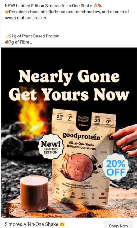
This creative promotes the S'mores All-in-One Shake, a limited-edition flavor. The format is familiar and well executed here: an urgent headline, a campfire background that ties into the flavor, and a clear discount badge.
The structure gives Meta several clear signals to work with, combining a discount, product news, and a clean, easy-to-parse visual.
To sharpen the ad further, test additional headline and badge copy.
If the data supports it, referencing units remaining or how quickly past limited releases sold out could add another layer of urgency.
3️⃣ Make sure ad copy aligns with product shown
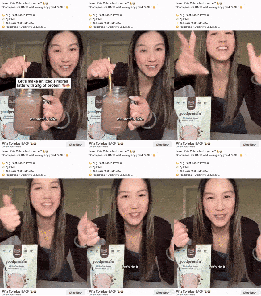
This creator ad has a lot working in its favor. Fast cuts and a self-imposed challenge create momentum, and the creator carries the brand's key selling points into the final shot, appearing with the finished product on camera.
The main issue is that the ad copy does not match the video. The text promotes the returning Piña Colada flavor, while the video features the new S'mores flavor exclusively.
Aligning the copy with the featured flavor would make the message clearer and remove a potential point of confusion for shoppers. Pilothouse also recommends testing opening hooks that call out limited availability directly, bringing that urgency into the video earlier.
4️⃣ Add a text hook and introduce the product early.
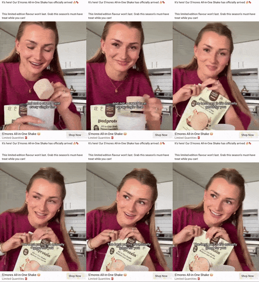
This is a solid piece of CGC. The creator describes the flavor while assembling the shake and keeps the Good Protein packaging visible throughout. Continuous movement helps the video feel natural and keeps the visual changing throughout.
Pilothouse recommends adding a text hook at the start of the video and introducing the product within the first three to five seconds.
Testing three to four variants would help identify which combination of hook and pacing performs best.
Movement matters in creator content generally. Creator briefs should include a note or reference clip showing that motion keeps footage from reading as stiff.
Conclusion
Good Protein's product story comes through strongly across this set, with engaging creator talent, appealing limited editions, and a product that lends itself well to visual creative.
The clearest opportunities are tightening the connection between copy and creative where needed, while continuing to test fresher executions of familiar formats.
Correcting the copy-to-creative mismatch and refreshing the formats already in rotation gives the team several useful tests without requiring entirely new creative concepts.
Did you find this valuable? Support us by checking out our businesses:
Please note that items in this newsletter marked with * contain sponsored content.
.svg)


.svg)


.svg)


.svg)
.svg)
.svg)