SPONSORED BY:



Good morning. Happy Friday!

Go on, send them this.
Here’s what’s in today’s newsletter:
Grab a coffee and let’s get into it. ☕
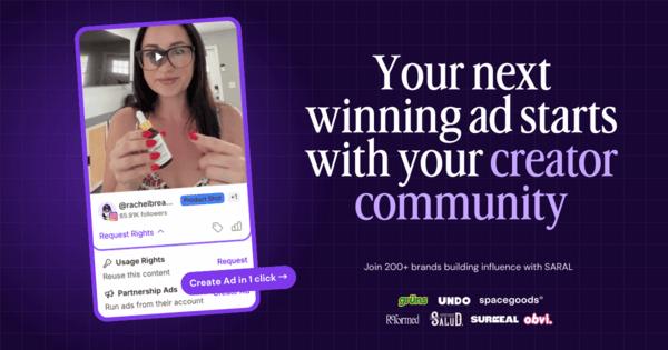
👀 Renting UGC gets expensive. Build this instead.
For a lot of brands, influencer marketing has become a loop. Find creators, brief content, feed Meta, repeat.
That loop produces ads. A stronger setup builds an influence engine that compounds by tying organic content, affiliate revenue, and paid creative together.
That’s the Predictable Influence model that Grüns, Solawave, Obvi, Proactiv, and 200+ other brands are building with SARAL.
If you're already spending on creators, ask yourself: are you building a network that keeps producing, or just renting a new batch of assets every month?
DTC readers get $500 off any SARAL plan.
* sponsored
💰 Muse shoppers are spending $200+ a purchase
Meta dropped some Muse shopping numbers on its latest earnings call, and shopping is officially the biggest thing people use it for. More than 25% of weekly active users shop with Muse, and the average purchase is over $200.
People are already buying through AI assistants, and that’s only going to grow. Make sure your product details, pricing, inventory, and shipping info are accurate wherever these tools might be looking.
📈 Meta ads are 14% pricier than last year
Also from Meta’s Q3 earnings: the average price per ad is up 14% YoY, and impressions are up 10%.
@herrmanndigital has a theory on what’s going on. Meta’s gotten really good at finding people who are already about to buy. But that pool eventually runs dry, and when it does, acquisition costs can spike out of nowhere.
What he recommends:
He says that last one has made performance steadier across his accounts, but you’ll need to give it four to six weeks. Test it against your own numbers as BFCM picks up.
⚠️ Meta’s new ad terms kick in October 30
Heads up: Meta updated its Self-Serve Ad Terms and Commercial Terms, and if you keep advertising after the 30th, you’ve agreed to them.
Two things worth knowing. Meta can now use crawlers and other automated tools to access and analyze pages connected to your business. And if Meta’s AI features create or pick your creative, you’re still responsible for it.
So before the 30th, check which AI enhancements are on in your account, and make sure the pages your ads link to only say things you’ve signed off on.
🎨 You can now point different creatives at different audiences on Meta
Meta added creative-level audience guidance to its Marketing API. Translation: compatible third-party tools can now tag individual creatives in the same ad set with age and gender signals. So one image could lean toward shoppers aged 50 to 65, while another runs more broadly.
These are suggestions, so Meta can still show an ad outside the group you picked.
If your buying platform supports it and you’ve already got creative made for specific segments, it’s an easy one to test.
🤖 Anthropic’s new Claude Duet works in the background
Super quick last one. Anthropic just introduced Claude Duet, an assistant that keeps an eye on your connected apps, sends you a morning briefing, and handles tasks while you’re doing other stuff. Think scheduling meetings, building dashboards, or putting together sales forecasts.
It’s in research preview for now. US Pro and Max subscribers can join the waitlist.
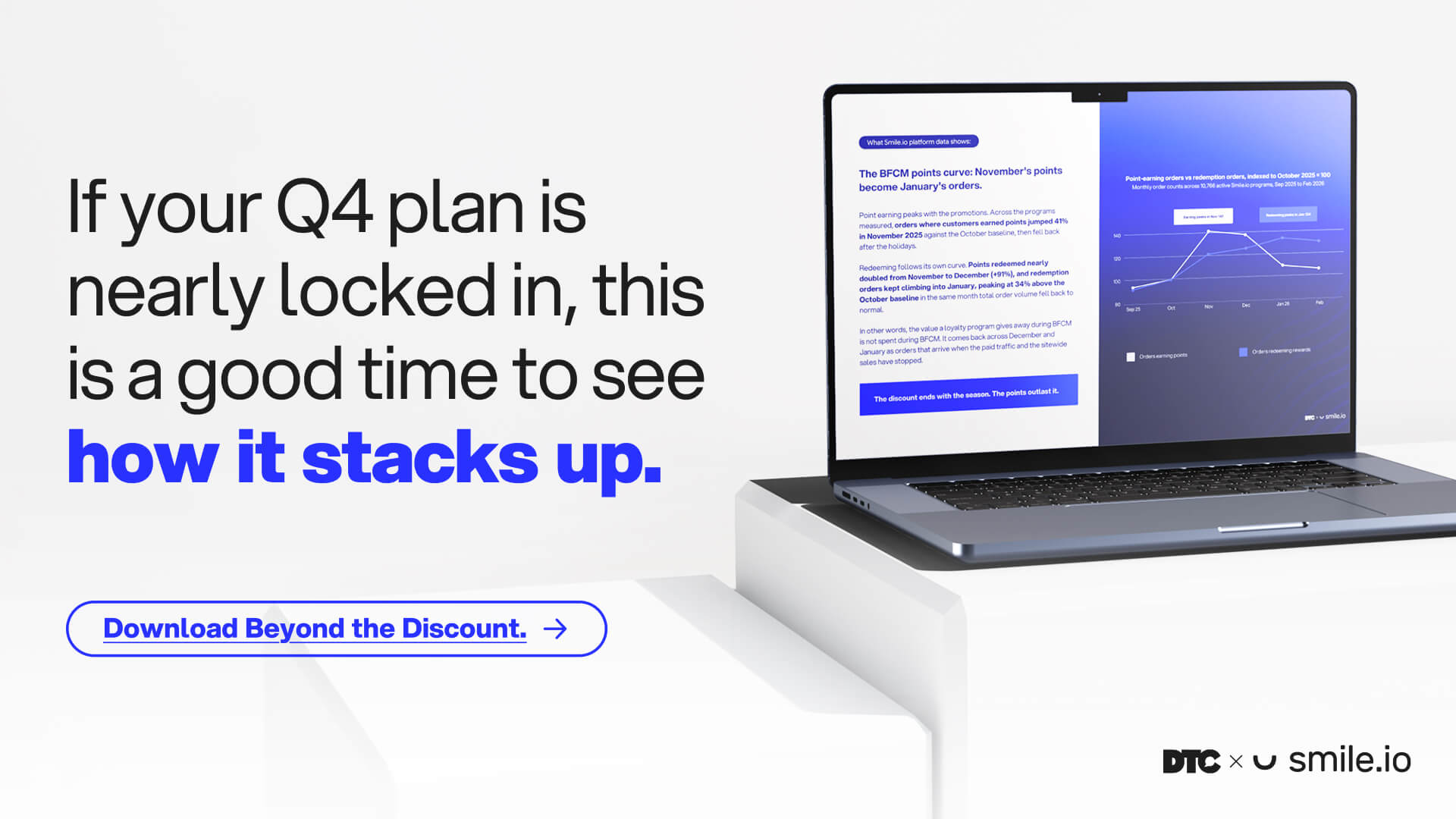
⏳ Two weeks left to pressure-test your BFCM offer
Q4 is the highest-stakes stretch of the year, and 45.7% of brands launch holiday promotions in early November or sooner. That leaves about two weeks to adjust.
72.5% of brands are running the same discount depth as last year. Beyond the Discount, from DTC and Smile.io, lets you check yours against data from 575+ operators and 700+ shoppers.
The report finds that the most common brand offer for new customers is 11 to 20% off, and the largest group of shoppers (46.6%) say it takes 20 to 25% to get them to buy.
Run the report’s six-question audit before your offer goes live.
* sponsored
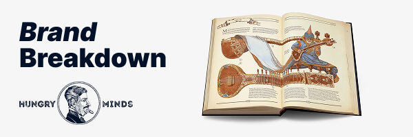
📚 Hungry Minds wrote the book on rebuilding civilization. Pilothouse has a few notes on the website.
Quick intro if you haven’t seen The Book: The Ultimate Guide to Rebuilding Civilization. It raised $3.2 million on Kickstarter. It’s sold more than 400,000 copies. It’s got 4.89 stars from more than 1,100 reviews.
It’s also massive, hand-illustrated, and clearly designed to sit on a coffee table and make your guests ask about it. Everything else Hungry Minds sells has the same vibe.
So yeah, the product kind of sells itself. Pilothouse’s CRO team poked around the site anyway, looking for places the website could help it out a bit more.
1️⃣ The homepage says the title twice
The homepage opens on the newest release, The Black Book. Gorgeous cover. Cute “New Product” badge.
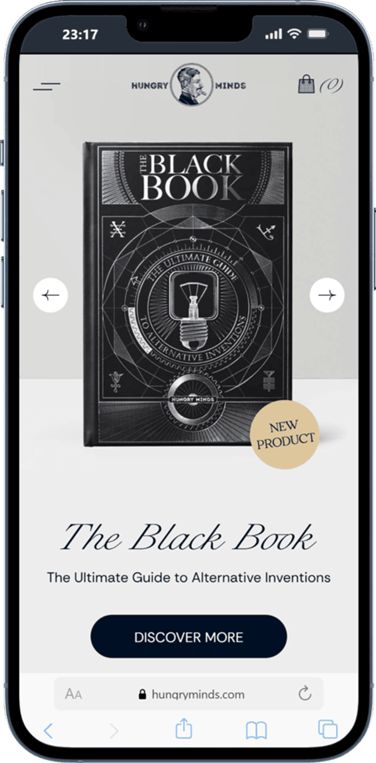
Then right below it, the text says “The Black Book” and “The Ultimate Guide to Alternative Inventions.”
Which... is printed on the cover. Right there. Just above it.
So someone landing on the site for the first time reads the title twice and still has no idea what’s inside, why it’s priced the way it is, or whether it’s for them.
Here’s what Pilothouse would try instead:
Headline: The Encyclopedia of Human Ingenuity
Subheadline: 300 hand-drawn pages and 180+ real inventions history left behind, co-authored with Pulitzer-nominated author Noah Charney. The heirloom coffee table book for curious minds, engineers, and creators.
Proof: 4.72/5 from 127 reviews
CTA: Explore The Black Book
2️⃣ A big catalog needs a few signposts
There’s a lot to browse here. Books, puzzles, different languages, a gift box edition, and 15+ bundles. Honestly, a nice problem to have.
The tricky part is that a lot of those are set up as their own separate products. On the catalog page, the English and Spanish versions of The Book show up next to each other as two listings, both at $119.
The bundles have great names: “Beyond Set,” “Foundations Set,” “Chronicle Set.” But you’ve got to click into each one to find out which books you’re actually getting. Having near-identical products on separate pages can also split up their reviews and search signals.
A few things Pilothouse would test:
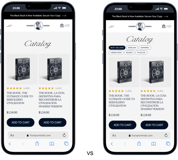
Filter-test inspiration: Oliver Kenyon.
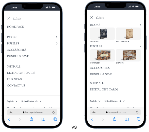
Same idea in the mobile menu. Swap a few of the text links for thumbnails of the bestsellers (The Book, The Last Book, and the Octopolis and Babylon puzzles), so people have something to actually look at.
3️⃣ Move the reviews up
Credit where it’s due, the product page nails the basics. Free shipping, 30-day money-back guarantee, Shop Pay installments, a delivery estimate. All sitting right by the Add to Cart button.
The reviews? Fourth accordion down, under Description, FAQ, and Delivery. That’s a 4.7 rating a lot of shoppers won’t see unless they go looking.
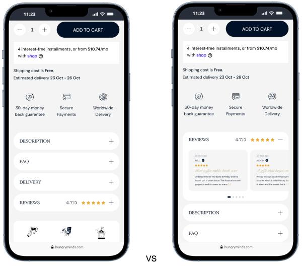
Pilothouse would pull them up with a little carousel higher on the page, closer to the buy button. Show the rating, a few short excerpts, which edition each person bought, and a link to read the rest.
And while you’re in there, give the edition choice some love too. There’s already an edition picker, but it’s two text buttons that jump to separate pages, with no picture of the box or note on what the extra $20 gets you. Put them side by side:
Regular Edition | Book only | Current price
Gift Box Edition | Book plus presentation box | Current price plus upgrade amount
Throw in a thumbnail and a quick line about the packaging, then see if more people go for the gift box.
4️⃣ Stop making people swipe for add-ons
The cart already suggests add-ons, and they’re smart ones: a $20 gift box for The Book and a $69 Twisted Lamp.
Problem is, they’re in a swipeable row, and the lamp is half off the screen.
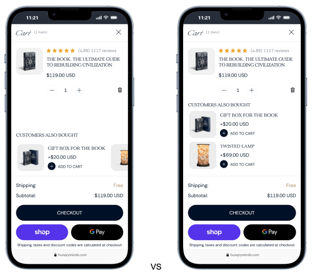
Easy fix: stack two or three of them on top of each other with a photo, price, and add button, and keep checkout right below. Watch checkout completion alongside add-on revenue, though. A longer cart shouldn’t make the main purchase harder.
5️⃣ Fix mobile speed before BFCM
Not the fun one. Maybe the important one.
The mobile report Pilothouse ran came back with a performance score of 39 out of 100. Largest Contentful Paint was 10.9 seconds. Speed Index was 25.1 seconds.
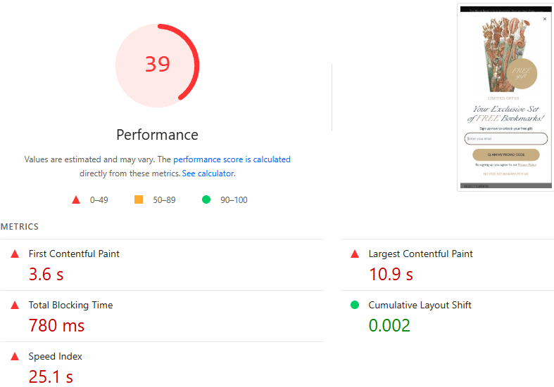
Start with the easy stuff: unused scripts, widgets that can load later, and a properly sized hero image. There are also about two dozen video reviews on the product page, so only load each one when someone hits play.
Then check load time and conversion after every change.
6️⃣ Give the practical stuff its own spot
The product copy is half the fun. It’s a little poetic, which makes sense for a book about rebuilding civilization.
The everyday questions (what’s in it, which languages, which editions, how it’s made) take more digging to answer. A short FAQ could cover those quickly without getting in the way of the storytelling.
The takeaway
Hungry Minds has already done the hard part. The sales and reviews speak for themselves, and the catalog looks like nothing else out there.
Most of what Pilothouse is suggesting is just moving good stuff closer to the shopper. Product story into the hero. Reviews next to the button. Add-ons out of the carousel. Test them one at a time and keep an eye on conversion, order value, and checkout completion.
Oh, and a homework assignment for your own store: open your homepage on your phone and read only the hero. Would someone new know what you sell and why it’s worth the money?