Good morning. Eric here. Tensions between Canada and the US are ramping back up this week, and if you move product across that border either way, you can feel the ground shifting.
In the name of controlling what we can, today we dive into Dagne Dover’s killer email flows with one non-fatal flaw…plus the cheapest CRO win you’ll run all week that takes less than a minute.
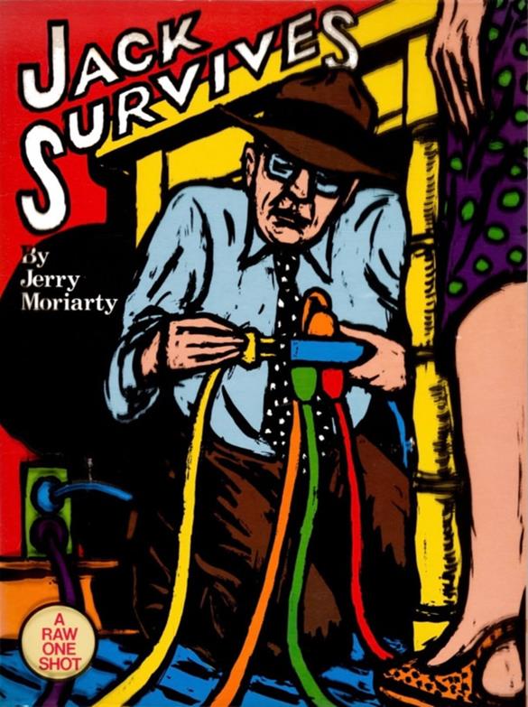
But first a meme I hand-plucked, and re-titled ”Being a digital marketer in 2026”
(credit @marknewgarden)
📦 One line under your checkout button can drive revenue lift
Dave Diederen (@DaveDiederen) tested adding "Ships by Tomorrow" directly under the checkout CTA in the cart drawer. Conversion rate went up 6.65%, revenue per visitor 9.04%, profit per visitor 9.31%.
By the time someone's in the cart, they've already decided they want the product. What's left is delivery anxiety, when will this actually show up, is shipping going to take forever. Answering that right at the button, instead of burying it in a shipping policy page, closes the last real objection at the exact moment someone's deciding whether to click.
Cheap test if you've got a fast fulfillment window to back it up. Add it in and let us know if it gave you a boost in conversion rate.
👁️ AppLovin's halo effect: now taking credit for impression conversions
AppLovin added a new attribution option called Clicks and Views. Right now your account only counts a sale if someone clicked the ad. The new setting also counts anyone who saw the ad and bought within a day, even without clicking, capturing the halo effect that click-only reporting misses.
It's opt-in. Your account stays on Clicks-only until you manually switch it in the attribution selector on the Reporting, Campaigns, or Creative Sets pages, and it only changes what you see in reporting, not optimization, targeting, or billing.
Jacob, who runs Meta at Pilothouse, flagged this internally, and his read is to keep optimizing off Clicks for now, but turn on Clicks and Views anyway just to see it. It won't change how the account runs, but it'll show you indirect value you're currently driving.
💵 $30 to $60 is dead money right now, and there's data behind why
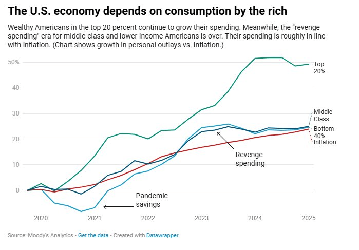
Jeff (my co-founder) sent me this post from Nick Shackelford, who he just had on the Agency Confidential podcast. He says any product priced $30 to $60 is stuck right now, people either can't afford it or their card declines on the rebill, while pricier stuff is at least steady.
He quote-tweeted a chart from Andrew Yang that explains why. The top 20% of earners keep spending more every year, everyone else is just tracking inflation with nothing extra to spend, and that's exactly the bracket that would be buying a $30-60 product on repeat. His advice is to stop being subtle, sell the specific pain point directly instead of the brand around it, that's what actually closes a $45-a-month decision right now.
🔍 Google's retiring DSA, you've got until February to deal with it on your terms
Dynamic Search Ads are going away as a standalone campaign type, folded into AI Max for Search instead. DSA used your website as the main targeting signal. AI Max pulls from keywords, ad copy, budget, and real-time intent too, and it can route traffic to any page on your domain instead of just the ones DSA had access to.
You can still manually build DSA campaigns until January 2027, auto-migration kicks in that February. Migrate on your own timeline before then instead of letting Google do it for you, that way you control the brand guardrails (Google gives you up to 25 search term exclusions and 40 messaging restrictions) and the URL routing instead of finding out what AI Max decided was relevant.
Not urgent today, but worth putting on the calendar.
Hey brand-side reader, close your eyes for a sec… this one's not for you. 🙈
waits…
Cool. Agency owners, we’re finally alone.
I started a network (okay, part support group) for 7-figure+ agency owners, and I named it… Agency.
On the nose? 👃 That's called branding, baby.
Here's the idea: we hand-curate tight 5-to-7-person groups of non-competitive agency owners, put you in a room together once a month, and facilitate the whole thing. You walk out with a personal board of advisors who actually get it. (I'll take Before & After for $500, Alex.)
One year in, we're 85 members deep, and the friendships and partnerships coming out of these rooms have been the best part of building it.
So if you've got an agency and a running list of problems, challenges, and "am I crazy or…" opportunities that could use a fresh set of eyes from your sharpest peers, come chat with Jeff and me at JoinAgency.co.
(Okay brand owners, you can come back now. We missed you.)

👝 Dagne Dover’s premium design and where flows could push a bit harder
Dagne Dover has built a bag brand around thoughtful design and everyday functionality.
Their emails feel polished, premium, and intentionally minimal. The flows reflect that identity well, with a few opportunities to tighten the customer journey and capture more first-time purchases. The Pilothouse team reviewed the Welcome and Abandon Cart flows to identify where to close the gap.
Trigger the Welcome email immediately after signup
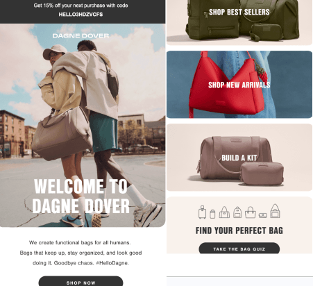
The Welcome Series is visually excellent. The layouts mirror the website, the copy feels polished, and the discount is placed prominently at the top of each email.
The first email waits 15 minutes before sending, while most brands trigger immediately after signup. That delay gives purchase intent a chance to cool. Since new subscribers are often waiting for their welcome offer, an immediate trigger would be worth testing against the current setup.
Personalize the flow using Bag Quiz responses
The flow collects valuable information through the Bag Quiz, but this data does not appear to influence the Welcome Series. Personalizing the flow based on quiz responses would increase relevance.
Someone shopping for a diaper bag has different needs than someone shopping for a gym or travel bag, and the flow should reflect that distinction.
Keep the final Welcome email more shoppable
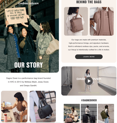
Content throughout the series is strong. The product blocks are clean, the magazine features reinforce credibility, and the founder and brand storytelling in the final email add personality without overwhelming the customer.
"Our Story" and "Behind the Bags" are worthwhile additions, but the final welcome email becomes less shoppable than the first two.
Pilothouse suggests pairing the founder story with featured products or category blocks would give customers a clearer path back to the site.
Move rewards messaging further down the journey
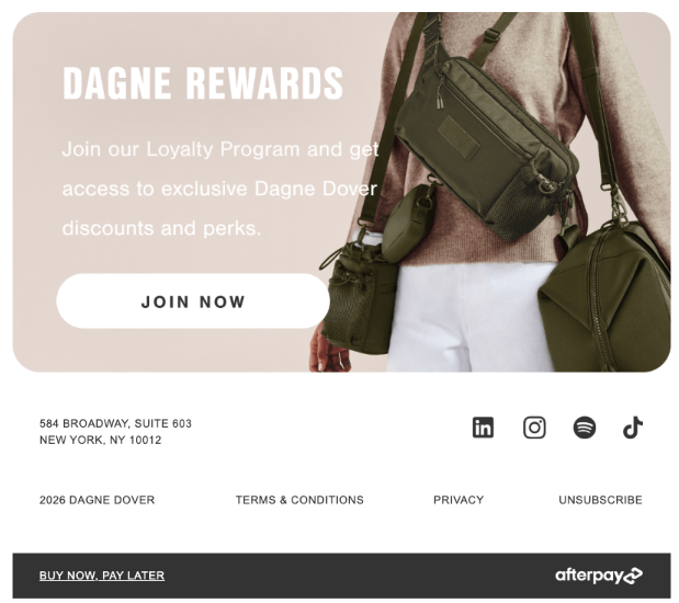
The rewards program appears in the first email before subscribers have made a purchase, which feels premature.
The "Visit Us IRL" section in Email 2 would likely resonate more if reserved for subscribers near the Soho location.
Tighten the cadence between Welcome emails
The gap between emails stretches to six days by the final touchpoint. Testing a tighter cadence closer to the industry standard would help maintain momentum while purchase intent is still high.
Extend the Welcome Series visual treatment to Abandon Cart
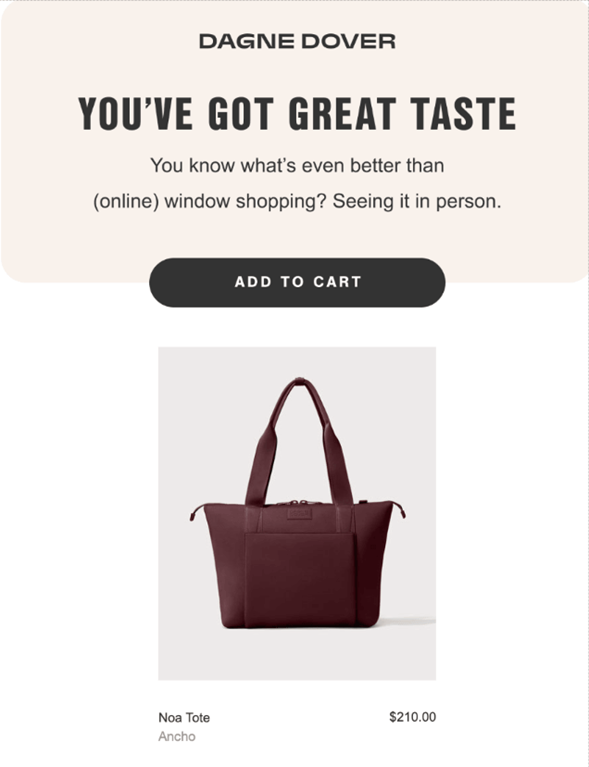
The abandon cart emails could borrow more visual elements from the Welcome Series. They do not need to be longer. Introducing similar premium visual treatments would create a more cohesive brand experience from signup through checkout.
Shorten Abandon Cart timing significantly
The Abandon Cart Flow takes a straightforward approach. The first email keeps focus on the abandoned product and provides a clear path back to checkout without unnecessary distractions.
Timing is the primary opportunity here. The first reminder waits two full days before sending, followed by a second email nearly two weeks later. Purchase intent has largely disappeared by that point. Industry benchmarks call for a first reminder around 20 minutes after abandonment and a second follow-up within 8 hours.
Add a prospect-only funnel flusher to recover first-time buyers
The flow stops short of giving first-time shoppers an additional reason to convert. A prospect-only funnel flusher at the end of the series, with a slightly stronger offer than the Welcome discount, would help recover customers who needed one final nudge. Limiting this incentive to non-purchasers protects margin while improving first-order conversion rates.
Conclusion
Dagne Dover delivers a polished customer experience. The branding is consistent, the emails are well designed, and the promotional messaging is clear.
The adjustments above would bring the flows' performance in line with the strength of the creative.
💸 You're missing sales if you're not auditing your Shopify store. Uncover high-impact growth opportunities that help boost your conversion and revenue with Gentoo's AI shopper simulations. Start your free trial. *
🛒 Running an online business? Your experience can help design the future of ecommerce tools. Join Blink UX’s research panel, share your insights, earn gift cards, and influence the platforms you use every day. Join here. *
* sponsored
Did you find this valuable? Support us by checking out our businesses:
Please note that items in this newsletter marked with * contain sponsored content.
.svg)


.svg)


.svg)


.svg)
.svg)
.svg)