
Good morning,
Compartés Chocolate has built something rare: a luxury food brand that’s instantly recognizable, culturally relevant, and commercially strong.
With sales up more than 200% since 2020 and a growing global footprint across DTC, retail, and corporate gifting, the next phase of growth isn’t about more traffic, it’s about extracting more value from the traffic you already earn.
Below is a CRO-focused review of the Compartés website, highlighting where small, high-impact refinements could unlock meaningful gains in conversion rate, AOV, and LTV without compromising the brand’s premium aesthetic.
Here’s what you’ll find in today’s DTC:
You’re reading this newsletter along with new subscribers from: SNAPS Decor, Proximo Spirits, and Pro Lash. 👋

💰 Turning Compartés Chocolate Into A Conversion Engine
1️⃣ Agentic Commerce
Compartés is already ahead of the curve by implementing agentic commerce via Google’s AI-driven shopping experience, powered by the Universal Commerce Protocol (UCP).
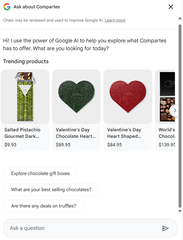
This is a meaningful advantage:
💡 Pilothouse Tip:
✅ Evolve with AI: Structure your Shopify catalog for agentic storefronts so products are not just available but preferred by AI assistants like ChatGPT, Gemini, and Claude.
At Pilothouse, we move your brand beyond traditional SEO and into the world of autonomous discovery, making your catalog machine-readable and transaction-ready for the AI-driven consumer.
This moves the brand beyond traditional SEO into autonomous discovery, where recommendations increasingly happen before a consumer ever sees a SERP.
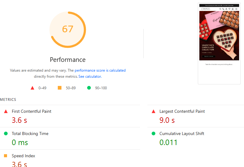
2️⃣ Website Speed
The site’s strength is its rich visuals and immersive product imagery.
But this is also its biggest performance risk, particularly on mobile.
Compartés scores a 67/100 on Google’s PageSpeed Insights.
While it gets a pass on some metrics like Blocking Time and Cumulative Layout Shift, all other metrics are falling below expectations.
💡 Pilothouse Tip:
✅ Compress images: Visual density often leads to slow load times, especially on mobile.
53% of mobile users leave if a page takes more than 3 seconds to load.
Compartés should ensure all images are compressed and consider "lazy loading" for their long scroll of products to prioritize speed and improve the LCP metric.
3️⃣ User Experience
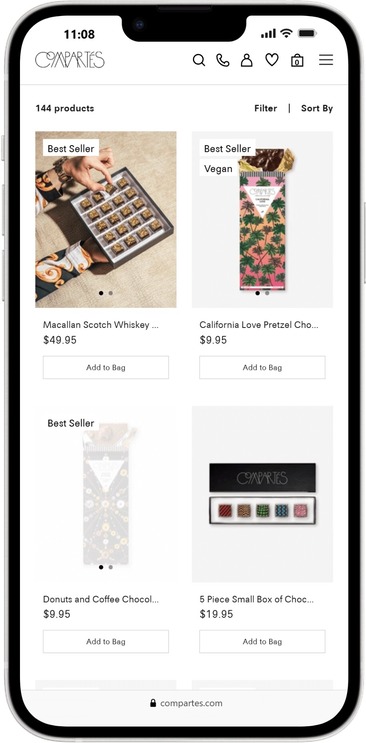
Compartés' site is filled with stunning visuals that effectively showcase their vast product assortment.
Holiday-based navigation (e.g. Valentine’s Day) is intuitive and aligned with gifting behavior.
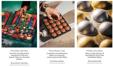
But some sections could use a refresh.
In this section, the brand highlights certain SKUs, but the visuals and text are outdated. Q4 has long passed, and items like holiday advent calendars are no longer top of mind.
They can use this space instead to plug Valentine’s Day or even preview Spring offerings.
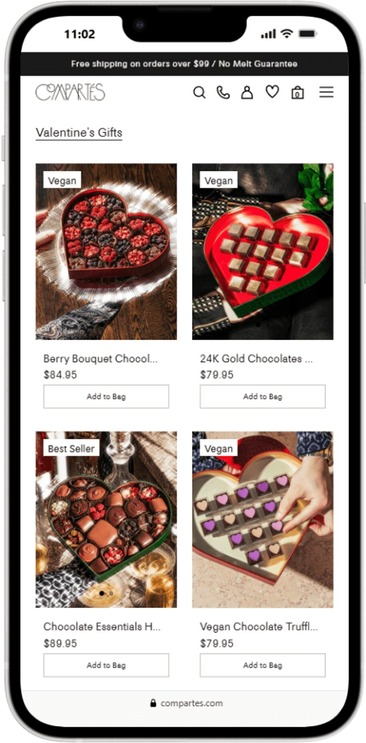
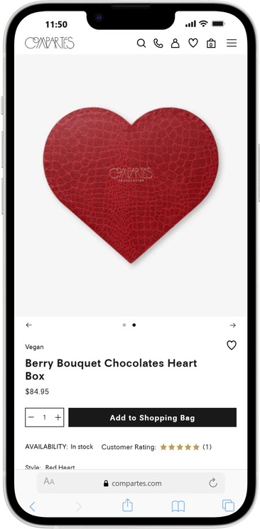
While the CTAs “Add to Bag” are straightforward, they could benefit from a more personalized touch to help customers differentiate between items.
With such a dense product assortment, repeated “Add to Bag” CTAs can overwhelm rather than convert.
💡 Pilothouse Tips:
✅ Use benefit-driven CTAs: The homepage is extremely dense with products, which can lead to "choice paralysis."
Instead of listing dozens of individual “Add to Bag” items, use more benefit-driven CTAs like "Find the Perfect Gift" or "Explore the Valentine’s Collection."
This guides the user through the funnel rather than forcing a purchase decision immediately.
✅ Make sure your website is up to date with festivities and seasonality. Compartés still have advent calendars and end-of-year gifting offers that should be removed.
If selling through past-season products is a priority, add a link on the menu that takes visitors to a “Clearance” collection.
4️⃣ Split-Testing
The monochrome design language is elegant and unmistakably Compartés.
But why not utilize other colors for Valentine's Day?
A/B testing allows you to improve conversion rate without increasing traffic, a direct lever on revenue efficiency.
Split testing allows you to make incremental changes, which can increase conversions.
You test one variable at a time (like the color of the "Add to Cart" button).
A/B testing increases ROI without increasing traffic, which is the biggest financial win.
For example:
💡 Pilothouse Tip:
✅ Start testing: For Compartés, the minimalist design offers several variables for testing.
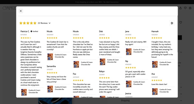
5️⃣ Social Proof and Trust
Compartés references trust signals (“Trusted by leading brands”) and hosts reviews, but much of this proof is buried in footers or secondary pages.
Social proof works best at the exact moment of consideration.
💡 Pilothouse Tips:
✅ Highlight glowing reviews: Integrate star ratings or short customer snippets directly onto product cards (e.g., "5.0 ⭐ (200+ Reviews)") on the homepage.
Seeing that 500 people loved the "California Love" bar while browsing increases the "herd mentality" mentioned in the guide.
✅ Leverage high traffic pages: Include reviews or Customer Ratings on the product container on homepage and collection pages, just below the price and above the “Add to Bag” button.
6️⃣ Capturing High-Intent Searchers
On-site search users consistently convert at 2–3x the rate of passive browsers. They’re not exploring. They’re buying.
If a user types "Valentine's Heart" into the Compartés search bar, they are in a "buying mode," not a "browsing mode."
Today’s standard flow looks like this: Search → Results → PDP → Add to Cart → Checkout
There’s an opportunity to collapse that funnel: Search → Add to Cart → Checkout
💡 Pilothouse Tip:
✅ Provide an immediate ATC button: This rewards intent with instant gratification, increasing the likelihood that the transaction will be completed before they start price-comparing in other tabs.
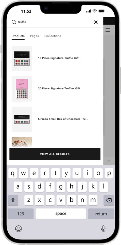
By removing two entire page loads (the results page and the product page), you eliminate the chance for the user to get distracted, encounter a slow-loading page, or change their mind.
This is especially effective for "Replenishment Shoppers,” those who know they want the "Dark Chocolate Sea Salt Bar" and don't need to read the description again.
7️⃣ Post-Purchase Experience & Retention
The brand currently focuses heavily on the pre-purchase journey, but the post-purchase experience is a prime opportunity for maximizing AOV.
💡 Pilothouse Tip:
✅ Implement a one-click post-purchase upsell app: Use a plug-in like ReConvert or Candy Rack.
For example, after a user buys a "Signature Truffle Box," they could be offered a "Donuts and Coffee Bar" at a 15% discount on the "Thank You" page.
Because the user has already entered their payment details, the friction to add a small, complementary item is near zero.
This "one more thing" approach can drive significant incremental revenue without affecting the core conversion rate.
✨ Conclusion
Compartés has already done the hard part: building a brand customers love and trust. The opportunity now is to fine-tune the digital experience so it converts as beautifully as it looks.
None of these recommendations requires a redesign or a departure from the brand’s luxury positioning.
They’re about precision. Removing friction, guiding intent, and making high-performing moments even stronger.
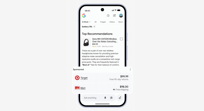
👀 Google Adds Another New Ad Format To AI Mode
Google begins testing another new ad format. When users are in AI Mode, they can now see ad placements clearly marked as Sponsored.
Google’s VP of Ads and Commerce Vidhya Srinivasan shares that “this new format helps shoppers easily find convenient buying options, and offers retailers the opportunity to show up in these key moments of consideration.”

📥 Got a B2B Biz?
Join dozens of B2B companies finding demand-gen success through our niche community of 150k brand leaders and founders this year. Talk to our team to learn more.
Have you heard our latest podcasts?
Don’t forget to rate the DTC Podcast on Apple (⭐️⭐️⭐️⭐️⭐️)
DTC Newsletter is written by Rebecca Knight and Frances Du. Edited by Eric Dyck.
Please note that items in this newsletter marked with * contain sponsored content.
.svg)


.svg)


.svg)


.svg)
.svg)
.svg)