
CREATED WITH
Thread Wallets is a modern accessories brand founded in 2015, built around reimagining everyday accessories with creative designs.
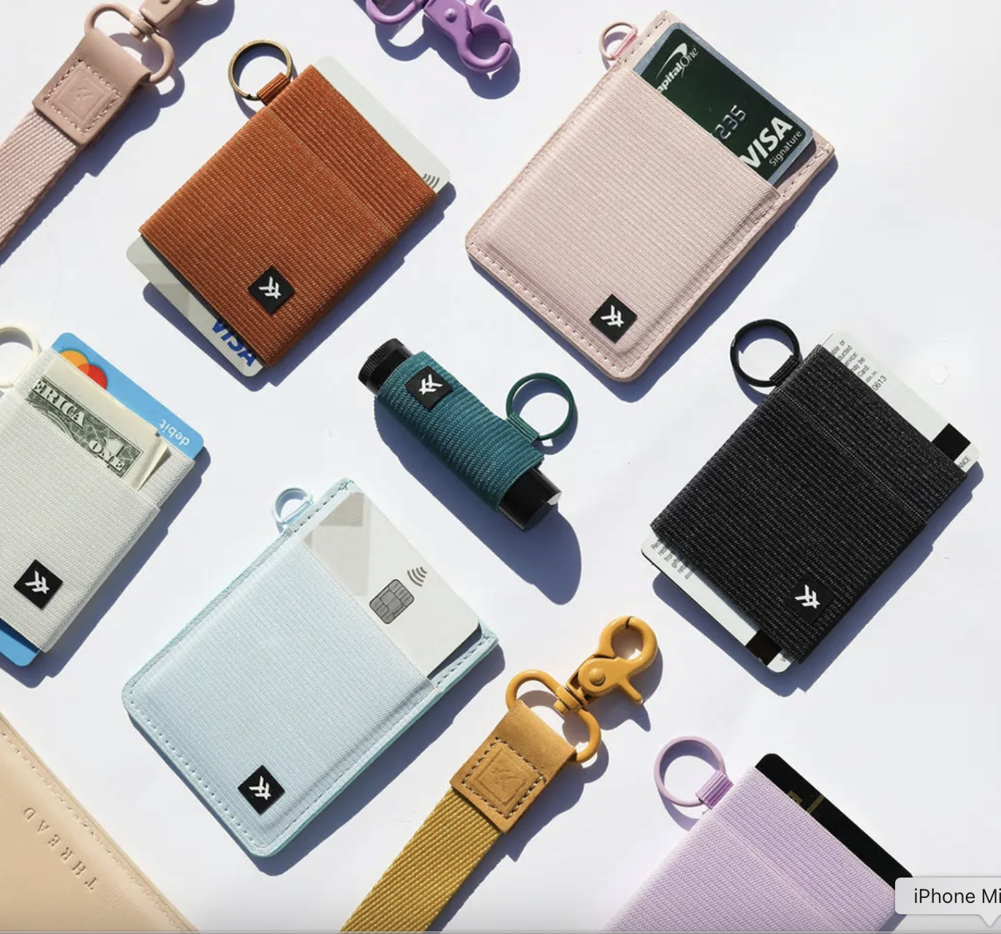
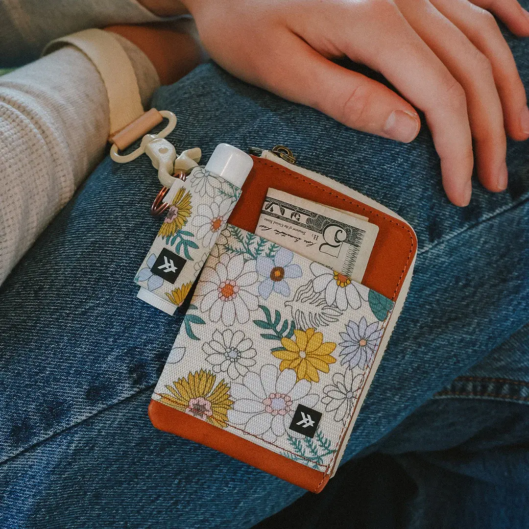
What started as a simple elastic wallet has expanded into a full lineup of “carry essentials” like lanyards, bags, and phone accessories.
With an estimated $12M+ in annual revenue and over 1,000 wholesale accounts, the brand has cultivated a loyal, youth-driven audience that values self-expression and functionality.
The products are compelling, the brand identity is cohesive, and the community foundation is clearly there.
The Pilothouse CRO team took a look at where thoughtful conversion optimizations could further strengthen an already solid foundation.
Conversion (Homepage)
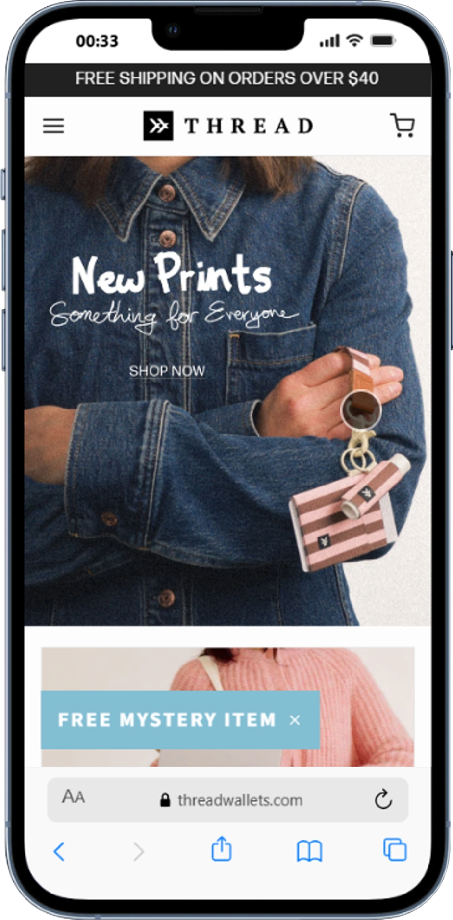
The current hero headline, “New Prints, Something for Everyone,” emphasizes newness and catalog depth, but reads as brand-led rather than purchase-led.
For a first-time visitor, the brand personality comes through clearly, though the immediate functional value could be even sharper.
When the functional value proposition becomes clearer earlier, it can often help shorten the path to purchase.
Replace the current headline with a benefit-first statement.
Something like “Slim carry goods made to organize your everyday essentials without the bulk” makes the offer more impactful.
Run the current hero against a variant with one clear CTA and a concise value headline to measure impact on click-through.
Conversion (On PDP)
Thread Wallets’ product pages do a number of things well.
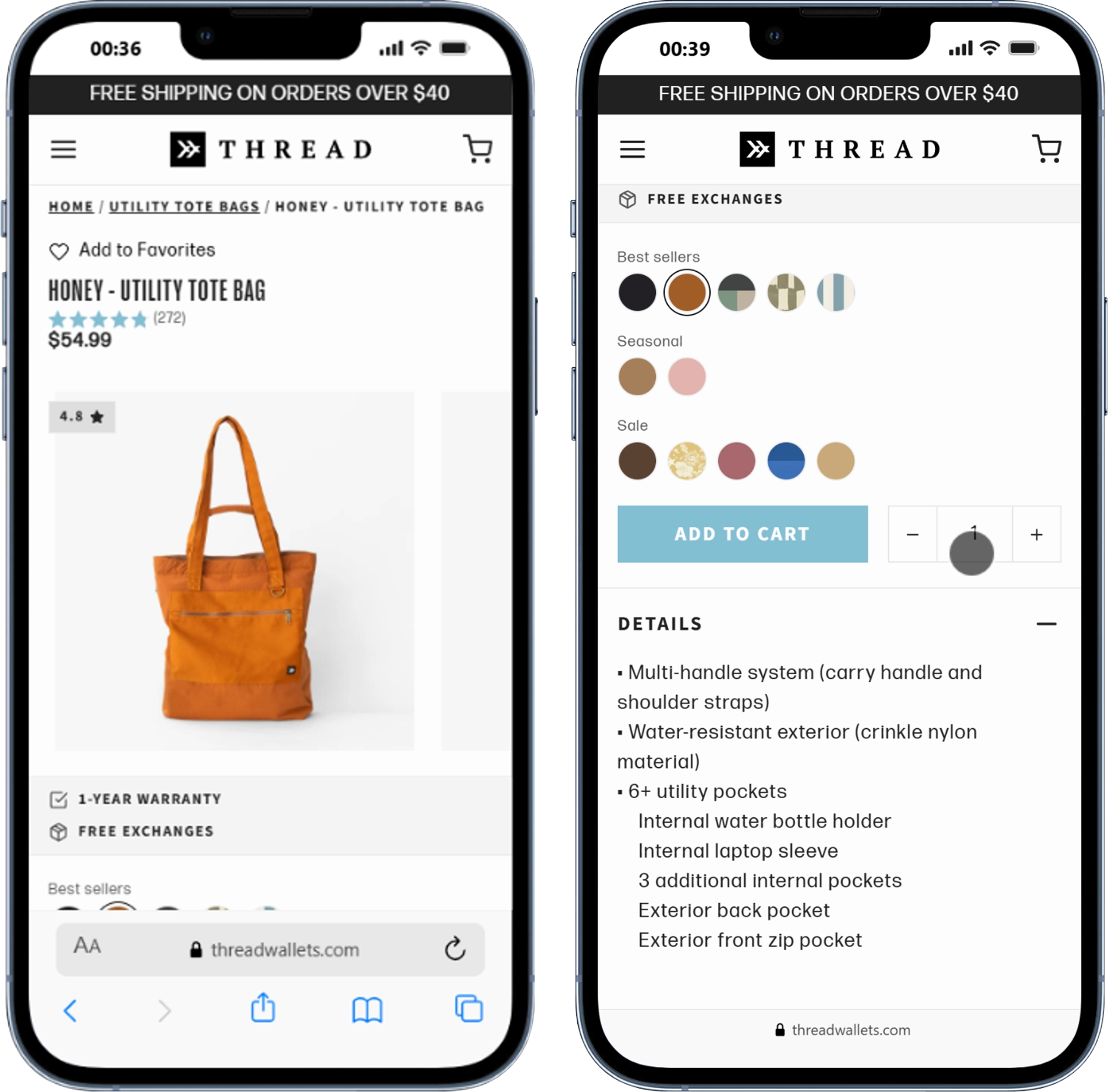
Social proof is visible, ratings are prominent (the Honey Tote shows 272 reviews at 4.8 stars), and the “Add to Favorites” functionality gives returning visitors a reason to re-engage.
These are real strengths.
Where there may be additional upside is in reinforcing purchase confidence even faster.
There’s an opportunity to answer the core shopper question even faster: ‘Will this fit my lifestyle and needs?’
Include info like shipping thresholds, return policy, and capacity details.
For wallet PDPs especially, capacity information (e.g., “Fits 8 cards + cash”) should appear above the fold.
A single line like “Not in love? Free exchanges, always.” can measurably lift add-to-cart rate on accessory PDPs.
Optimization (On mobile)
Mobile may represent one of the highest-leverage opportunities for incremental revenue gains.
Fast scanning, quick variant selection, and snappy load times determine whether a visitor converts or bounces, especially for accessory brands.
Thread’s mobile experience appears to have meaningful optimization opportunities across each of these areas.
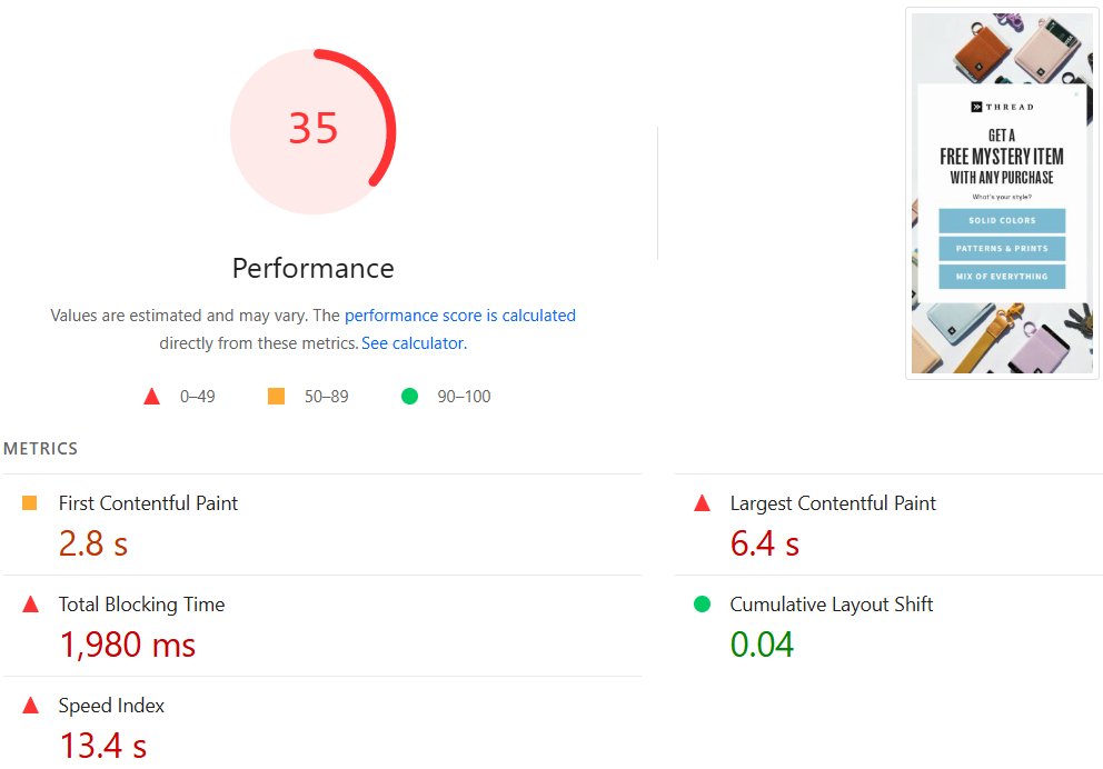
The site’s PageSpeed score currently sits at 35, which may indicate meaningful room for performance gains. The Largest Contentful Paint (LCP) is 6.4 seconds, Total Blocking Time is 1,980ms, and the Speed Index is 13.4 seconds.
These performance metrics suggest there may be meaningful room for speed improvements. Improving these could help more visitors reach the purchase decision stage. The main product image is typically the LCP element on Shopify PDPs, and right now it’s not being served in WebP/AVIF format or preloaded above the fold.
The tote bag PDP screenshots illustrate another issue: the page is long and scroll-heavy before the ATC button appears. On mobile, every extra scroll is an exit opportunity.
This alone can cut LCP significantly. Preload the first product image to prioritize it in the browser’s rendering queue.
Keep the ATC visible as users scroll through product details and reviews.
Third-party apps (reviews widgets, loyalty tools, chat) are likely contributing to the 1,980ms Total Blocking Time. Remove or defer anything not directly tied to conversion.
Run a variant with a smaller preloaded hero, lazy-loaded gallery images, and compressed content blocks above the fold.
UX & Content (Homepage)
The homepage has the right ingredients—lifestyle imagery, category navigation, and a product grid—but the sequencing prioritizes brand identity over buying intent.
The homepage performs best when it answers three questions quickly: what is this, who is it for, and what should I look at next?
Right now, the brand story reads like positioning copy rather than a buying guide. That’s valuable for credibility, but shouldn’t come at the expense of routing visitors into the right collection quickly.
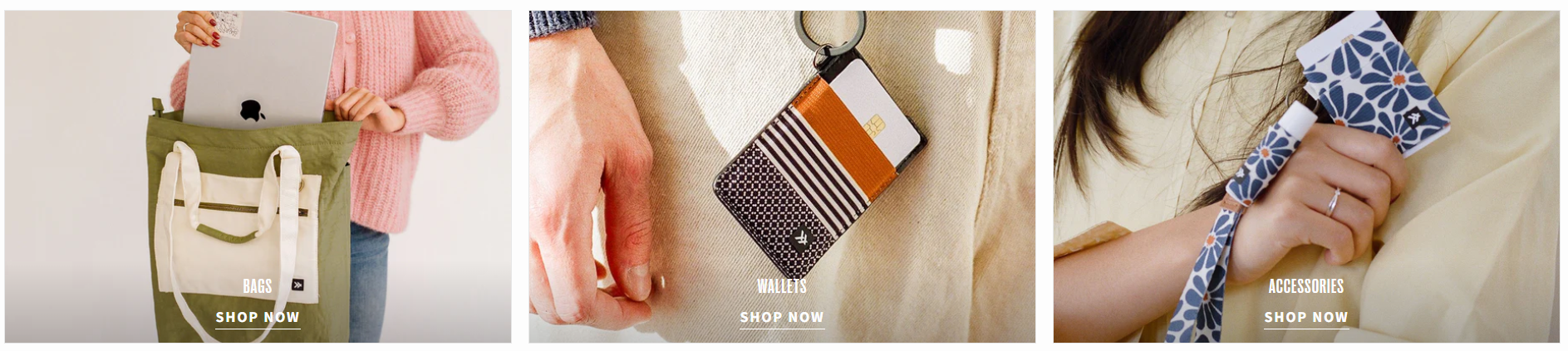
The lifestyle imagery in the collection thumbnails (bags, wallets, accessories) is excellent—it could likely benefit from stronger copy anchoring.
Something like “Carry less. Express more. Shop slim everyday essentials built for movement.”
This bridges brand voice with purchase intent.
“SHOP NOW” works, but consider testing out: “Shop Wallets,” “Find Your Bag,” and “Accessories” as tile labels to reinforce navigation intent.
UX & Content (Navigation and collections)
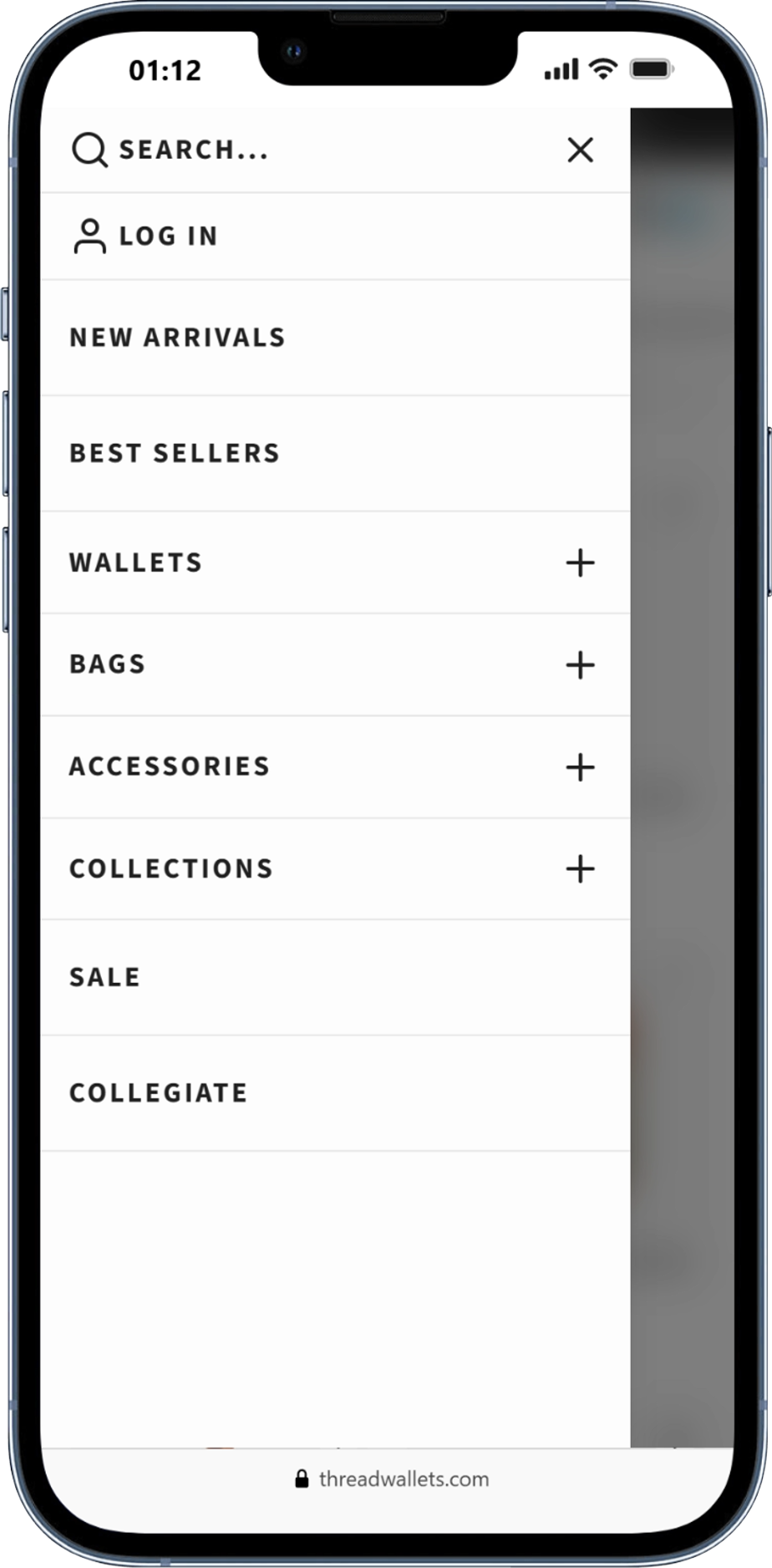
Thread’s deep catalog is a real competitive advantage, but without intentional navigation architecture, it can cause choice paralysis.
The current mobile nav shows: New Arrivals, Best Sellers, Wallets, Bags, Accessories, Collections, Sale, and Collegiate. This is product-type navigation, which works well for people who already know what they want.
One potential enhancement could be layering in more intent-based navigation: entry points that match how shoppers actually think.
Someone buying a gift doesn’t think “I need a wallet”; they think “I need something under $30 that looks cool.”
“Everyday Wallets,” “Travel Bags,” “Best Gifts Under $25,” and “Match Your Style” give visitors faster paths to relevance and support gift-shopping behavior.
This reframes the catalog around lifestyle rather than product type, a natural fit for Thread’s identity-driven audience.
UX & Content (Product pages)
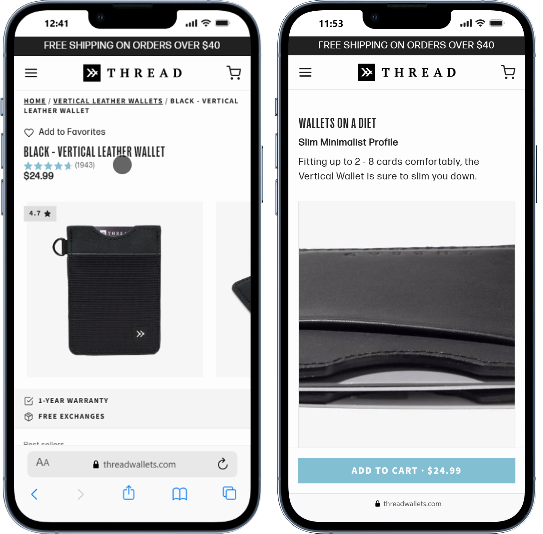
The product page is already a strong conversion asset, with clear room to become even more persuasive. The Vertical Leather Wallet PDP illustrates both existing strengths and additional upside: 1,944 reviews at 4.7 stars is extraordinary social proof, but it’s not being leveraged near the point of purchase.
The headline copy, “Wallets on a Diet / Slim Minimalist Profile,” is great brand voice, but the follow-up copy is generic.
Helping visitors understand Thread’s distinct functional advantage faster could further strengthen conversion.
Each PDP should lead with one sentence that frames what the product solves, show capacity and size visually, include a brief “why it’s different” callout, and place reviews and trust signals within scrolling distance of the ATC button.
“Designed to carry the essentials without the bulk” placed above the review stars sets purchase context immediately.
A simple icon-based spec block (“Fits 8 cards,” “4mm slim,” “Weather-resistant”) is more scannable than paragraph copy and builds confidence faster.
Don’t make shoppers scroll past all product details to reach social proof—show a star rating summary and 2–3 highlighted reviews in the upper PDP zone.
Group colorways with clear labels and highlight bestselling options. Consider a “Most Popular” badge on the top-selling variant.
UX & Content (Cart and checkout)
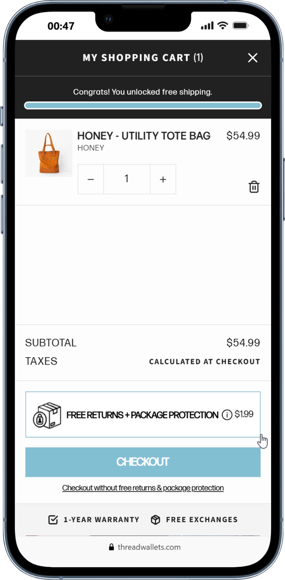
The cart screenshot shows a clean, well-structured drawer. The shipping progress bar (“Congrats! You unlocked free shipping.”) is a nice touch. One notable opportunity is expanding the cart’s upsell potential.
If the cart primarily functions as a checkout bridge, there may be additional AOV upside available.
The cart should reinforce shipping thresholds, bundle savings, and easy add-ons without feeling pushy.
Cart is where AOV and checkout completion can be lifted together.
Thread’s catalog is naturally built for bundle logic. A shopper buying a wallet is a strong candidate for a matching keychain, pouch, or card sleeve.
These add-ons are low-price, low-risk, and highly complementary. This makes them particularly well-suited for thoughtful one-click upsell integration.
Show 2–3 complementary items (“Complete the Set”) with a single add button.
If a customer is $8 away from free shipping, call it out explicitly with a product recommendation that gets them there.
Given Thread’s strong gifting use case, a gift wrap option can increase both AOV and gifting conversion.
The opt-out framing (“Checkout without free returns & package protection”) may be creating confusion. Test a clearer opt-in version to see if it reduces friction.
Thread Wallets catalog naturally lends itself to gifting, bundling, and repeat purchase. The foundation is solid.
The opportunity now appears less about reinvention and more about strategic conversion refinement.
The highest-leverage wins are concentrated in two areas: above-the-fold clarity and product-page persuasion.
Sharper homepage clarity, stronger PDP trust signals, and continued mobile optimization could compound meaningfully over time.
CREATED WITH